Grubhub
Creating the Grubhub brand that led to hyper-growth
I joined Grubhub in 2005 as the second hire and sole designer. For the first few years, I was responsible for everything — UX, visual design, branding, and product marketing — while the company figured out what it was. By 2010, Grubhub had grown fast enough to need a real brand: one that could run national ad campaigns, hold up across transit, digital, and print, and signal to a mainstream audience that ordering food online was something worth trusting. I led the creative direction. This is how that brand came together.
Brand Strategy
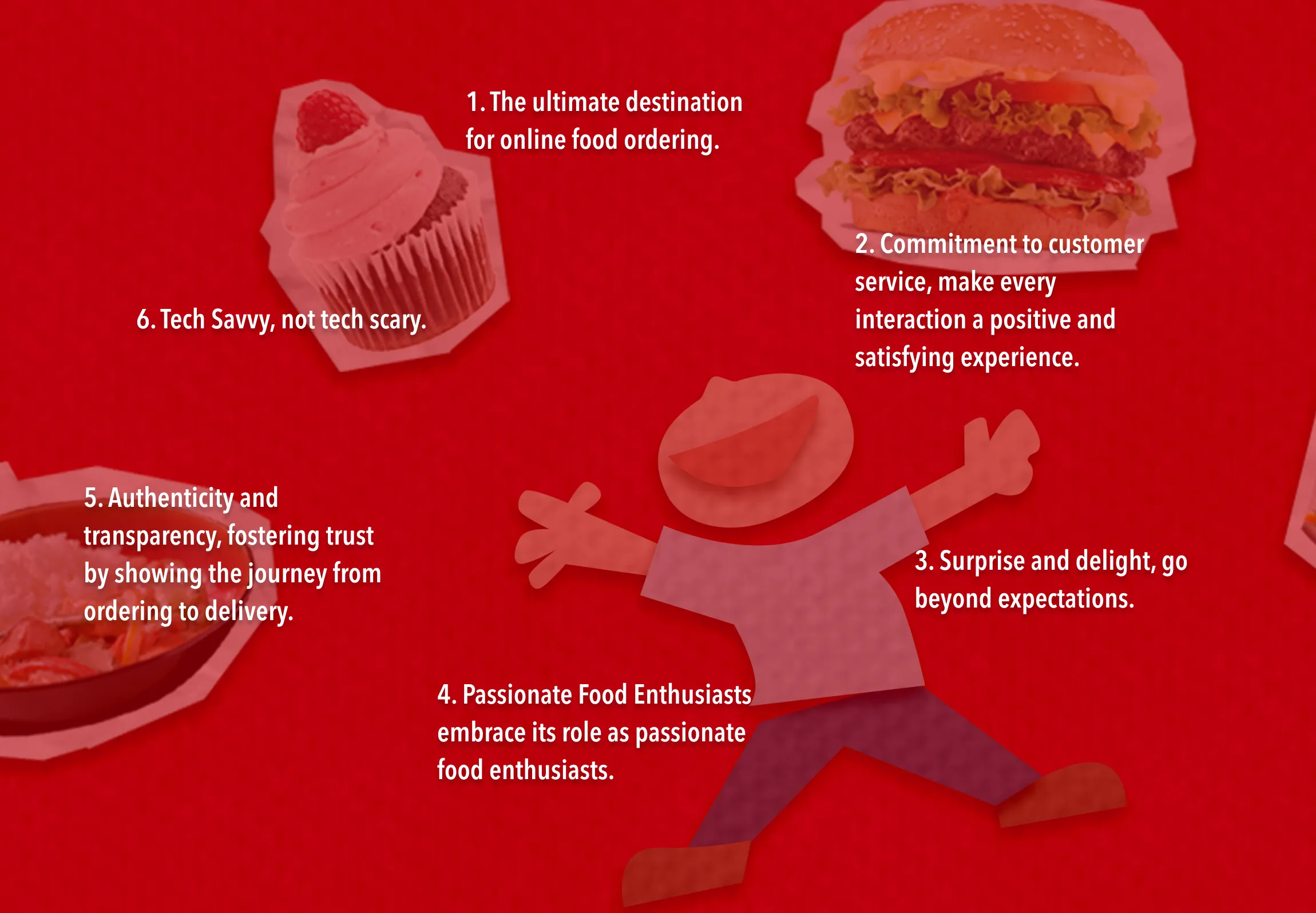
The Tenets That Shaped the Brand
Online food ordering in 2010 was still a trust problem as much as a convenience one. People were skeptical about handing their credit card to a website to handle their dinner. The brand had to work against that skepticism — not by being slick, but by being genuinely warm and honest. We grounded everything in three tenets: delight, authenticity, and transparency. These weren’t aspirational values to put on a wall. They were filters. Every creative decision got tested against them. If something felt too corporate, too cold, or too clever, it didn’t make it through.
Ads That Had to Work
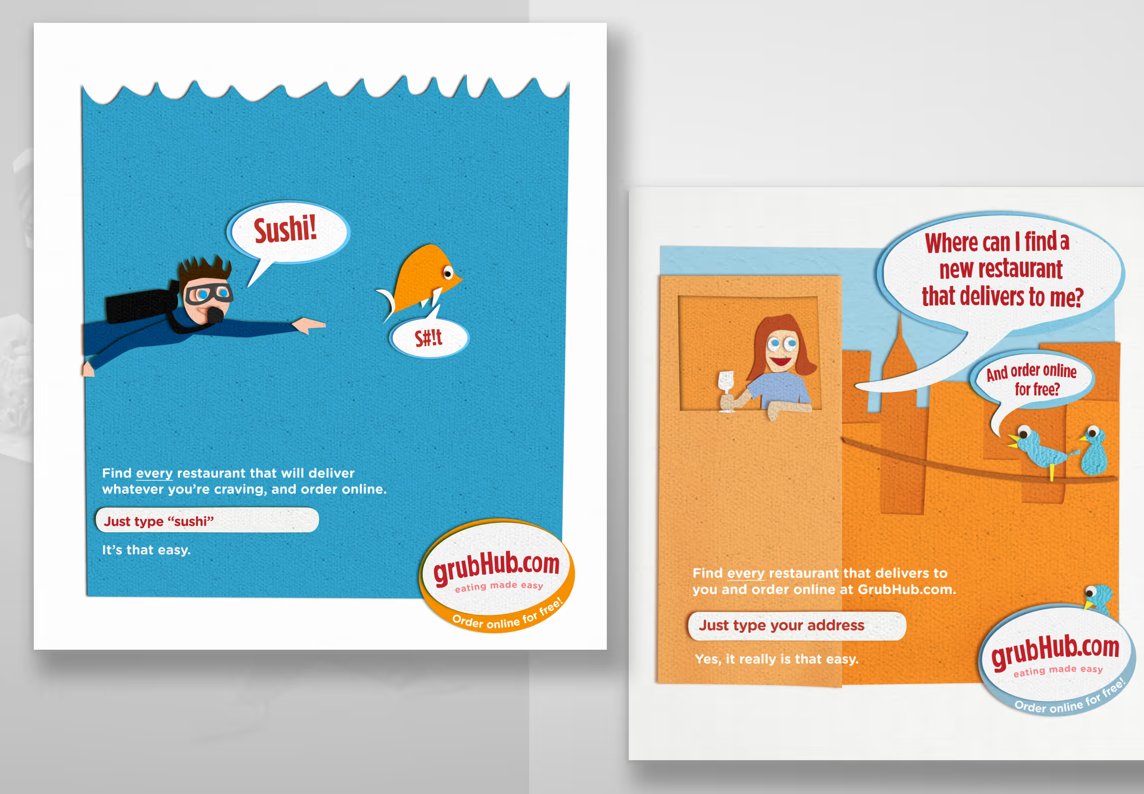
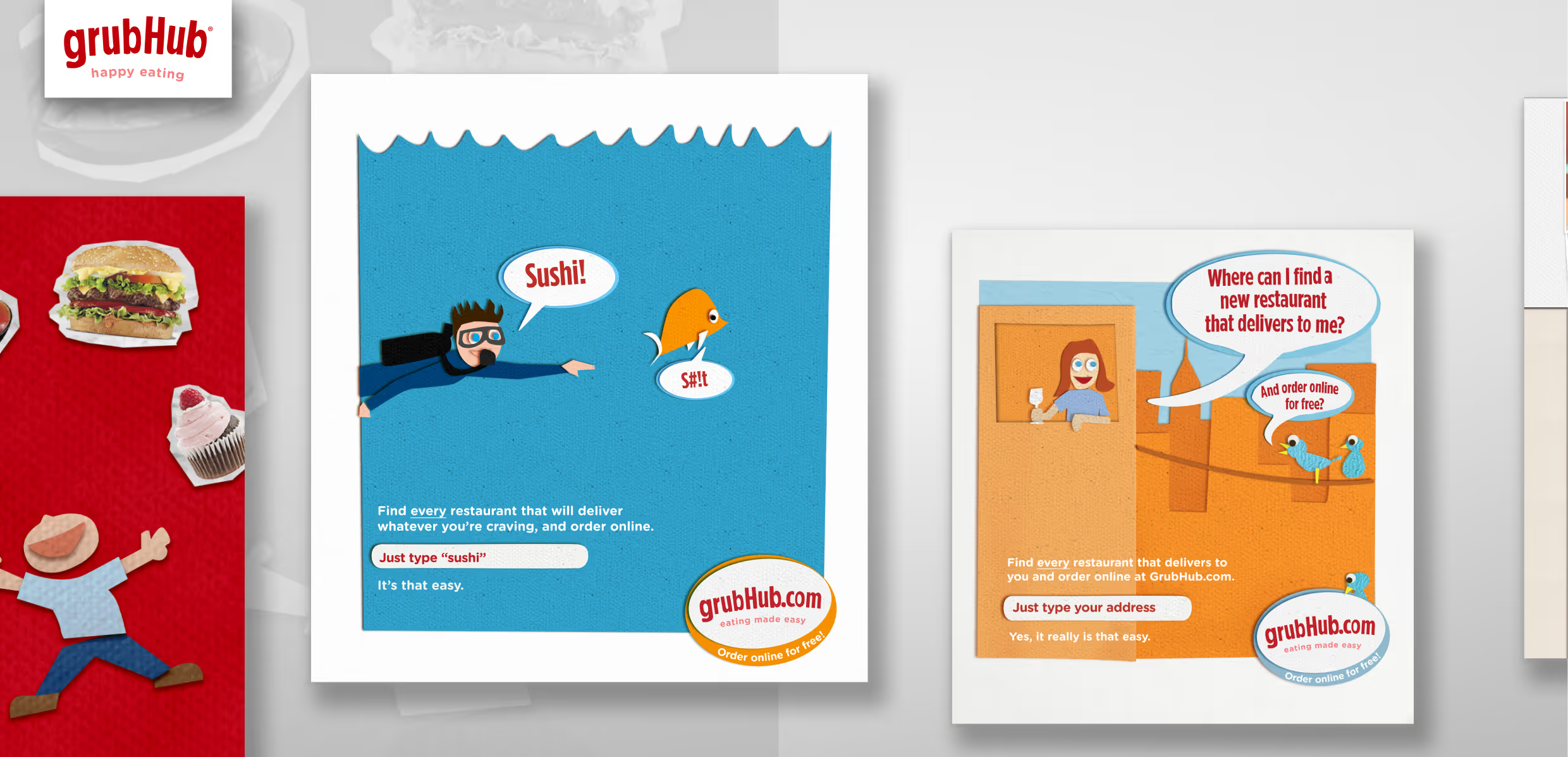
The transit campaigns ran across New York, Chicago, San Francisco, Boston, and LA — millions of commuters, five very different markets, one visual language. The creative had to work at a glance, in a crowded environment, for someone who wasn’t looking for it. That constraint pushed us toward emotional clarity over cleverness: ads that made you feel something about food and convenience in the two seconds you had with them. We tested extensively to find what actually landed before anything went up on a wall or a subway car.
The campaigns drove a 20% increase in traffic in each city where they ran — measurable market expansion tied directly to the creative.
Designing For Emotion
The Paper Texture That Almost Wasn't
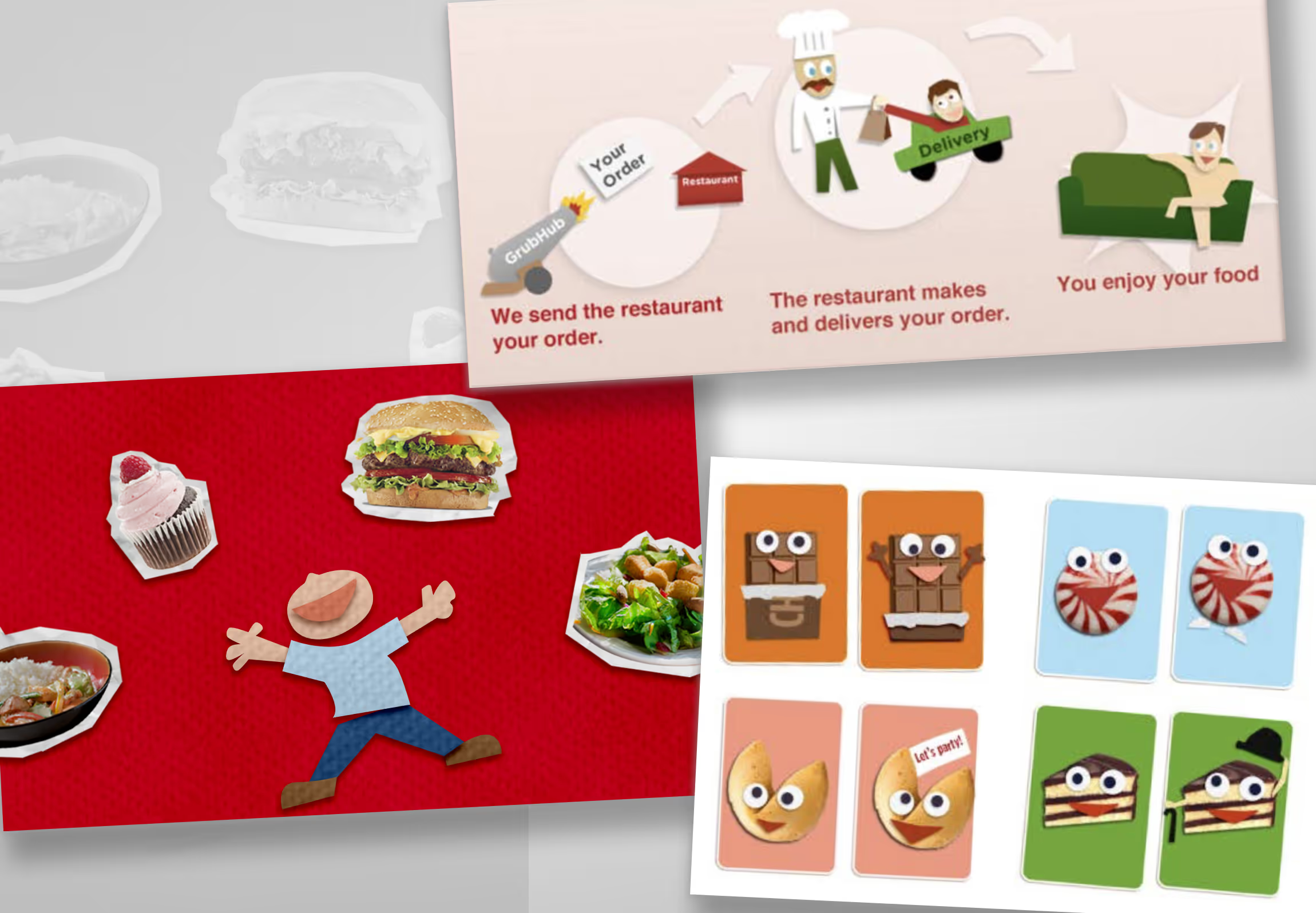
Food photography in 2010 was either aspirational and cold or cheap and forgettable. We wanted neither. The imagery we chose was warm, specific, and slightly unexpected — the kind of food that makes you hungry, shown in a way that felt real rather than styled.
The paper texture that became central to the visual system nearly didn’t happen. We tested roughly 20 visual directions before landing on it — and that particular direction was thrown in as a throwaway idea. It wasn’t the direction anyone would have predicted going in. But what we saw in interviews told us people loved it.
Unique and Distinct Typography
When No Type Off the Shelf Fit, We Set Our Own
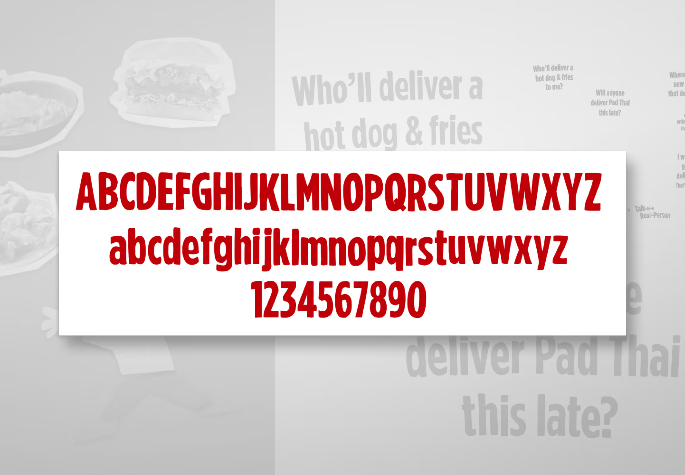
Once the handcrafted aesthetic was established as the visual foundation, it created a problem: no existing typeface felt right in it. Standard options looked borrowed. So we designed a custom font — letters drawn by hand, structurally informed by Gotham Condensed, but with the same warmth and irregularity as the rest of the brand system. The goal was to make sure that any word set in the Grubhub typeface felt unmistakably Grubhub, whether it appeared in a transit ad, on the homepage, or inside the product.
Landing Page DesignContent strategy
The Homepage Pulled Double Duty
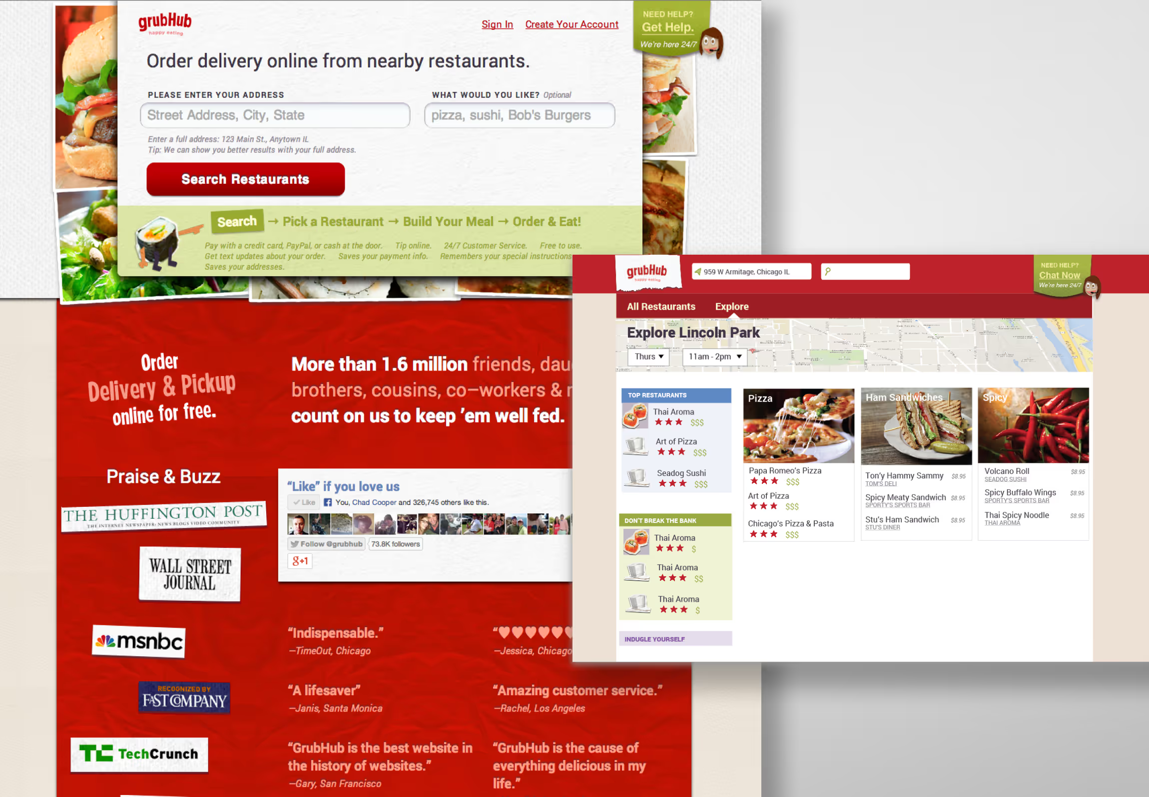
The homepage was where the brand met the business. It had to communicate what Grubhub was to someone who’d never heard of it, build enough trust for them to enter their address, and do all of that without sacrificing the warmth and personality of the brand. The handcrafted visual system carried through the layout, but the page had to be clean and direct enough to actually convert. Personality without clarity is just noise — this had to be both.
Logo Design
Buck the Trends to Convey the Brand
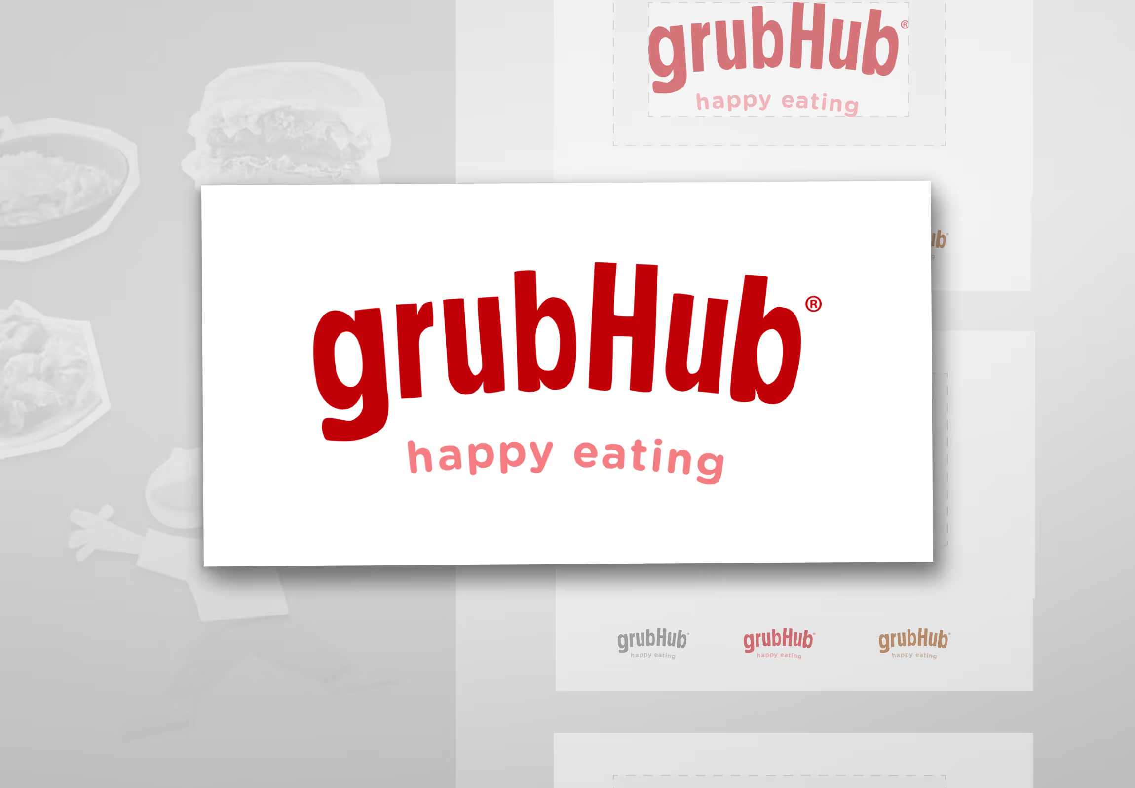
The wordmark had one job: feel approachable without feeling cheap, and energetic without feeling juvenile. That balance took longer to find than almost anything else in the project. We went through dozens of iterations, testing the logo against the ads, the homepage, and the broader visual system as it developed — which is why it ended up being the last thing we locked down, even after the ad campaign was already finished. In a conventional process, the logo comes first. Here, letting everything else inform it produced a better result.
Creative DirectionBranding
People Crave Authenticity
The transit campaigns ran across New York, Chicago, San Francisco, Boston, and Los Angeles. In each city, we tracked conversion against baseline. The ads drove a 10% lift in conversion in markets where they ran — measurable, city by city. The social response was immediate and unsolicited: people were photographing the ads, sharing them, talking about them. For a brand that had been largely invisible outside the product itself, that kind of organic visibility was new.
The brand held through the Seamless merger — absorbed into a combined identity that had to bridge two distinct brand systems without losing either. That it survived contact with a merger is the longer-term proof of whether a brand system was actually built or just styled.