Hummingbirds
Designing a support system that scales without headcount
Hummingbirds connects brands with local creators. People who post about the coffee shops, pasta sauces and restaurants they actually use. Thirty-plus markets at the time, and the next move was going national.
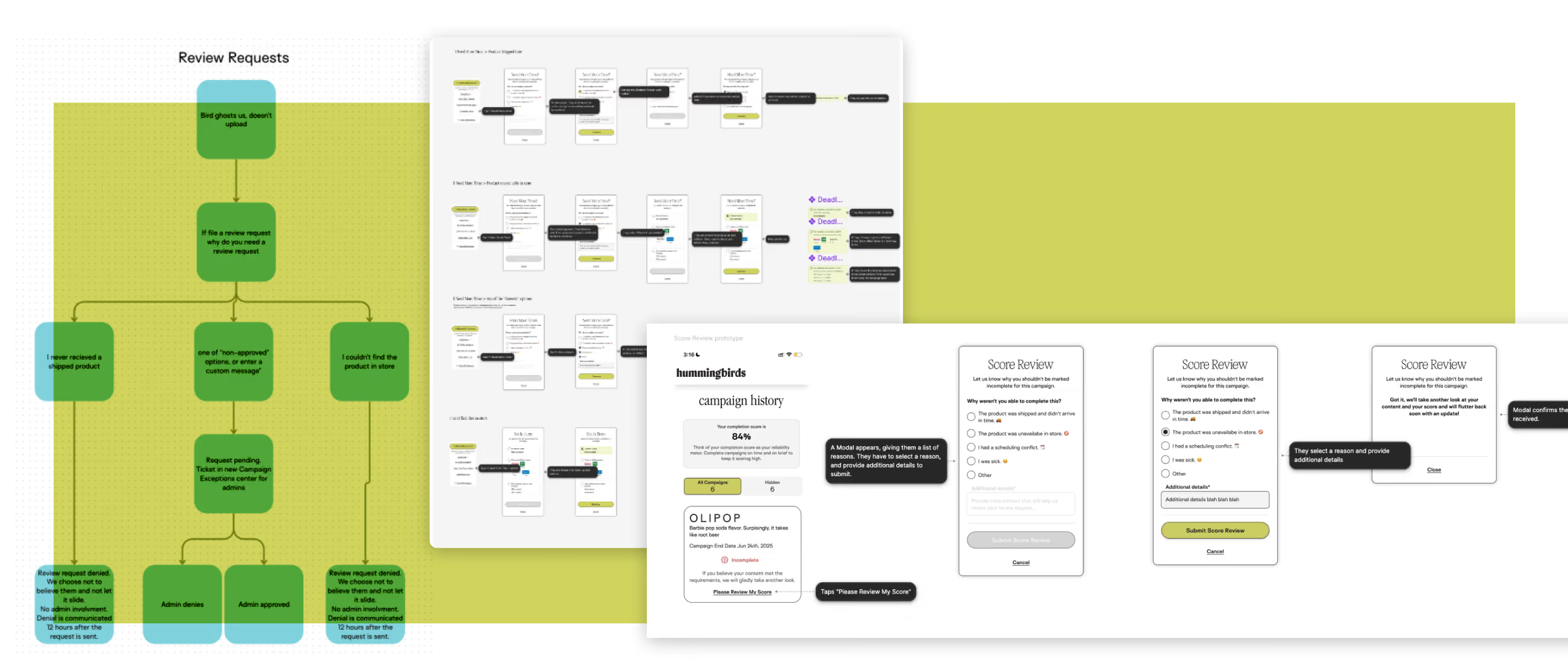
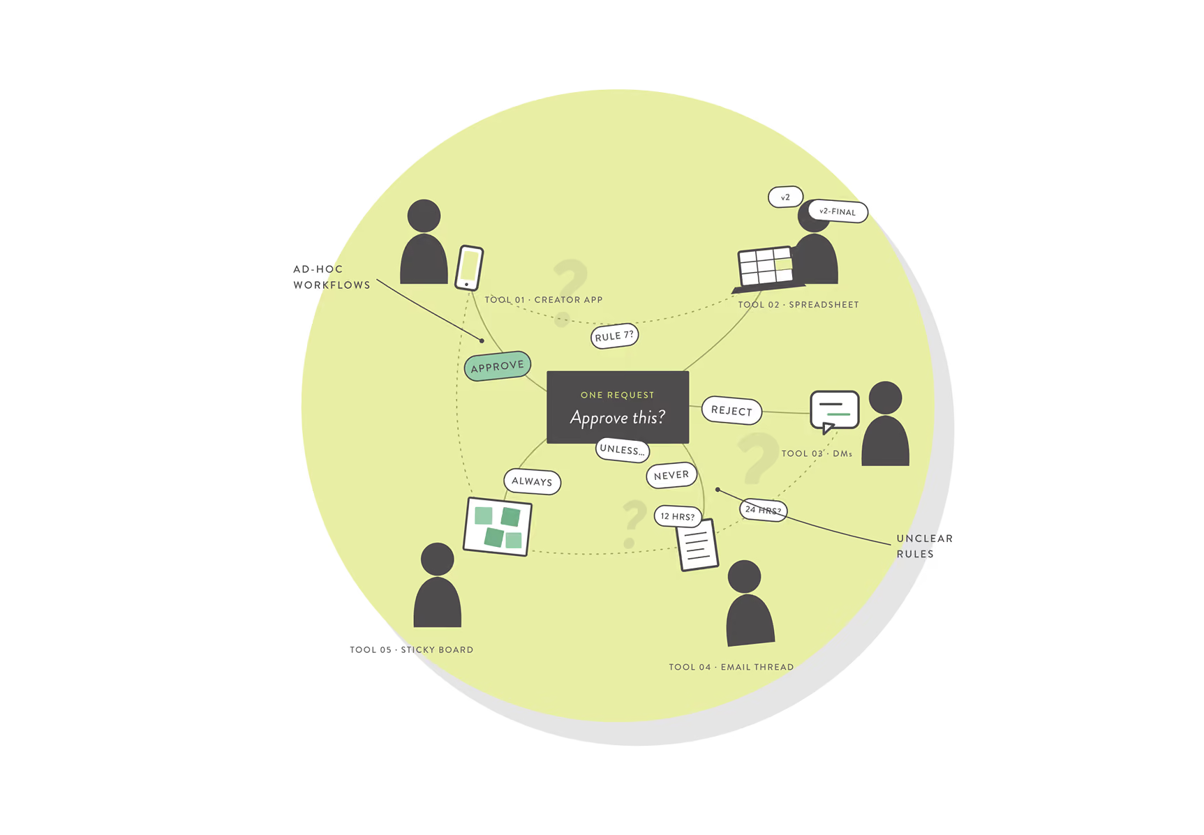
Customer service was the piece that couldn’t come along. The chatbot handling creator problems sat outside every other system we ran. A creator who couldn’t find the product, needed more time, or wanted out of a campaign ended up in front of one of roughly ten account admins, who resolved it by hand across whatever tools happened to be open. A routine ticket ran over an hour and passed through more than one person. A cancellation could take days of back and forth. It held together across thirty markets, mostly, and nobody in the room thought it would survive national expansion.
The assignment was to move customer service into the creator app and connect it to the internal admin platform and the brand platform. I owned the research, the system mapping, all four surfaces, and a lot of uncomfortable conversations about requirements that didn’t exist yet.
What We Were Trying to Move
The measures that mattered were the share of creator requests resolved without an admin touching them, time to resolution, and admin hours per market as the market count grew. I asked for current numbers at kickoff and twice after and they never came. The org wasn’t tracking customer service as an operation yet, which is part of how it got to this point.
What could be established, I established from the admin sessions: ten admins, thirty-plus markets, an hour-plus of handling time on a routine ticket, cancellations running days. None of that came out of a system, so it’s an approximation. The targets stayed directional. Automate what could be automated, cut the handoffs, make admin time scale slower than market count. The project was justified on structure, with no delta to point at.
The Terrain
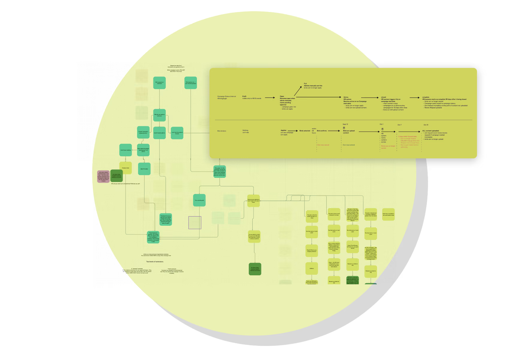
Nobody at Hummingbirds had ever drawn the full system.
Admins knew their own approval rules. Brands knew what they wanted to see. Product knew the technical constraints. The whole process lived in five or six people’s heads and no two of those heads agreed on the shape of it.
I interviewed admins to surface every rule and every step, asking why each decision got made rather than just what the decision was. I read every scrap of documentation I could find. Then I traced each creator scenario through the existing toolchain end to end.
The hardest knot wasn’t the tools. It was time. Which flows a creator could access changed depending on where the campaign was in its lifecycle, and nobody had written that down either. A cancellation request means something different in week one than it does the day before content is due.
What the Sessions Surfaced
Several scenarios were already deterministic. Admins were following a set of rules that already existed, informally, and applying them consistently, so that part was straightforward to systematize.
The admin tool had no integration with the third-party chat software. That one cost a week of investigation and eventually cost us the chat vendor entirely.
The remaining scenarios had no rules at all, and the ten admins had each built their own workflow to cover for it. Ten people, ten processes, assembled independently out of whatever tools were nearest. Some of them were working to rules the others didn’t know existed, and nobody had a way to tell whether two admins facing the same request would land in the same place.
The presenting problem was operational, too many tools and too much manual work. Underneath it, half the decision logic had never been written down, and you can’t automate a judgment nobody has articulated. Design work couldn’t start until that logic was explicit.
Principles and Constraints
The constraints I set before opening Figma, and pointed at constantly to keep scope from expanding in four directions at once.
Protect judgment where it matters. Automate everything and you lose the oversight that protects the brand relationship, and a cancellation nobody approved is still a cancellation the brand has to absorb. Require admin review for everything and you’ve rebuilt the manual system with a nicer interface. Decisions have to propagate on their own. Anything resolved in the admin tool updates the creator and the brand platform automatically, with no secondary steps and nobody chasing a status. Creators come into this already frustrated. We don’t get to make their job harder in order to make our internal workflow easier.
Structure Before Screens
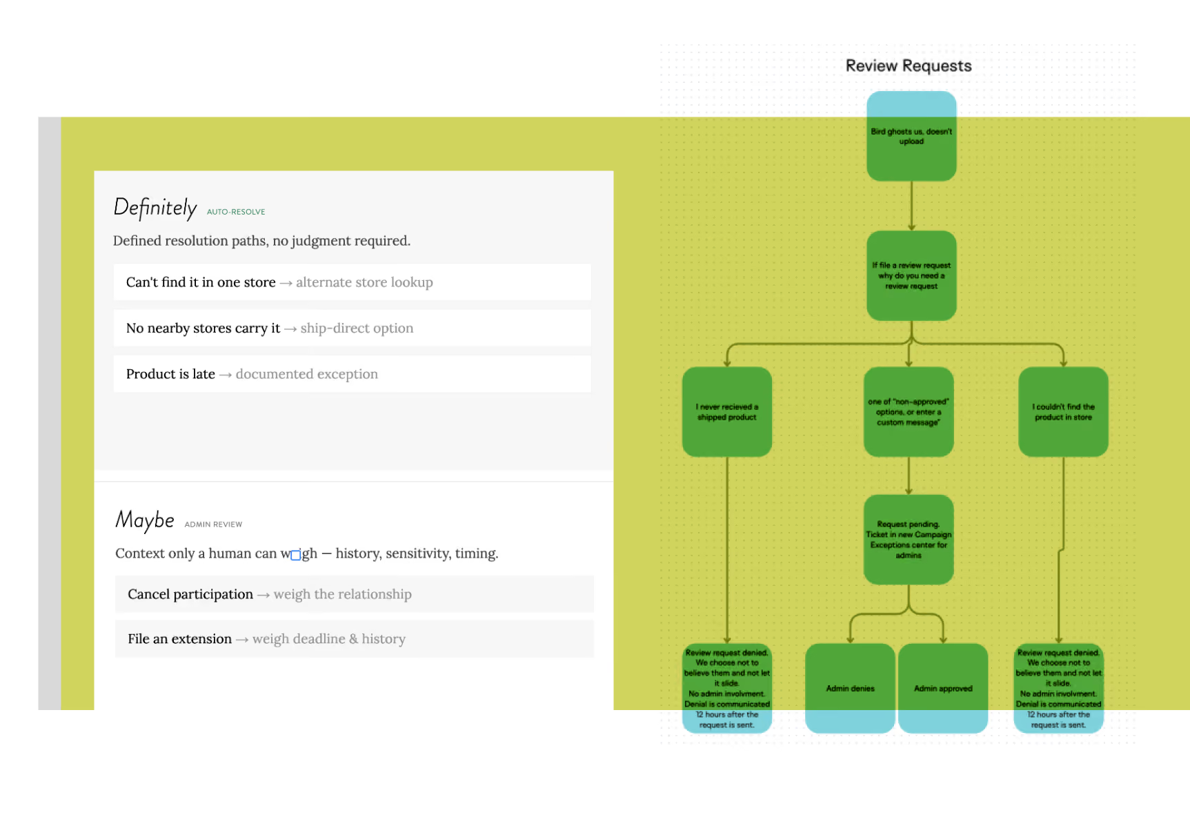
The information architecture question here was data ownership. What lives where, who can act on it, and what fires downstream when they do.
Five creator-initiated scenarios: * Cancel Participation * File an Extension * Can’t Find Product In-Store * No Product Nearby * Product Arrived Late
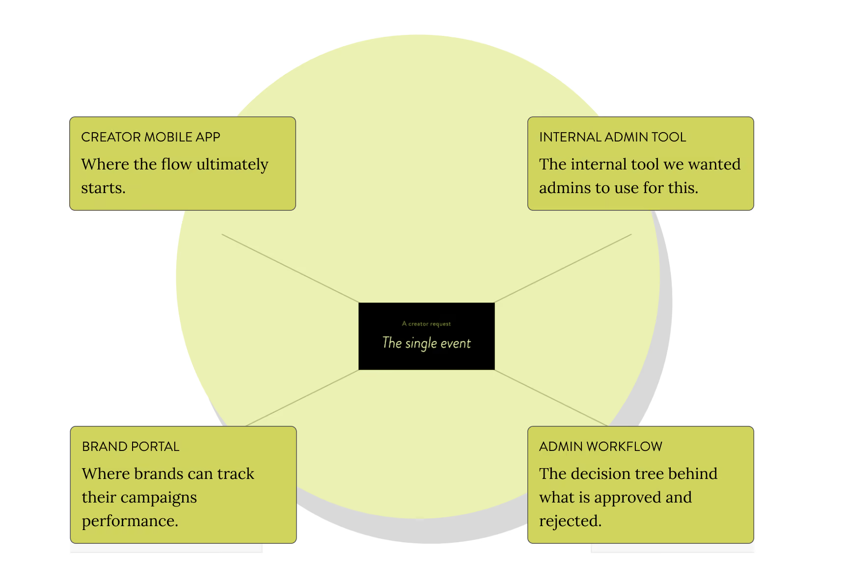
Four surfaces, each handling all five: * Creator mobile app — where every request now starts * Internal admin tool — where humans make judgment calls * Brand platform — where brands track campaign performance * Admin workflow logic — the decision tree behind what gets approved and rejected A cancellation is an admin notification, a brand analytics update and a campaign adjustment, all at once. Mapping that before any screen work meant the dependencies were visible while they were still cheap to change.
Decision Logic
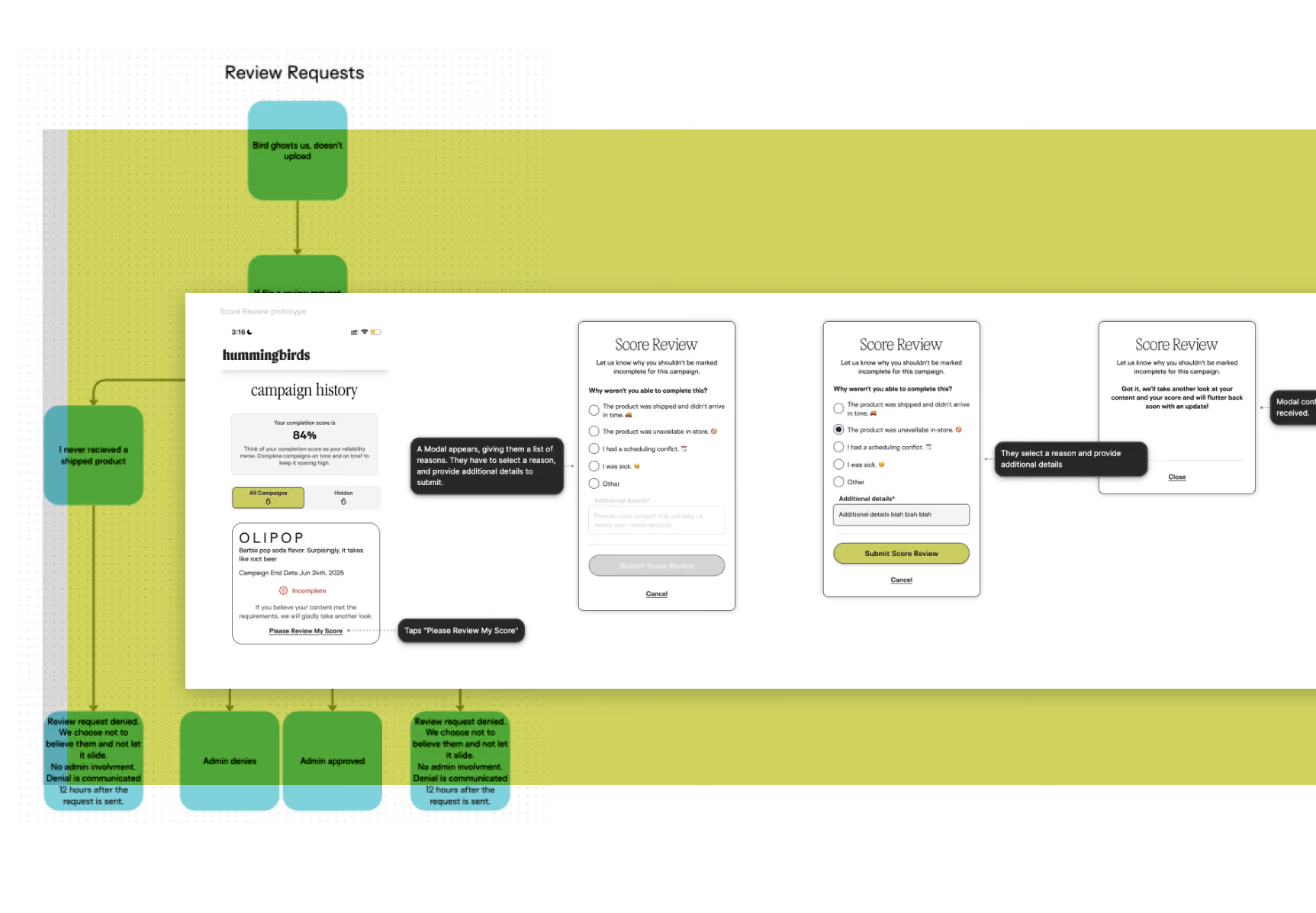
I worked through every scenario with admins, asking the same question each time: what makes this a yes or a no without you in the room, and what genuinely needs you?
Automated: product availability. Can’t find it in one store, no nearby store carries it. Defined resolution paths, no judgment required, no reason for a person to sit in the middle adding delay. Kept with admins: cancellations and extensions. Both need context only a human can weigh — creator history, brand sensitivity, how close the deadline is.
With the logic codified, content structure followed from it directly. Every label and status message came out of the decision rules, and the naming was precise because the rules were finally precise.
Building the Surfaces
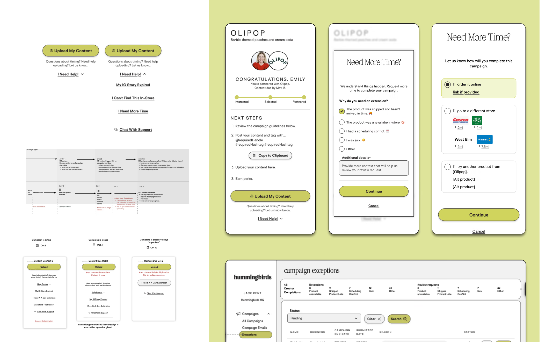
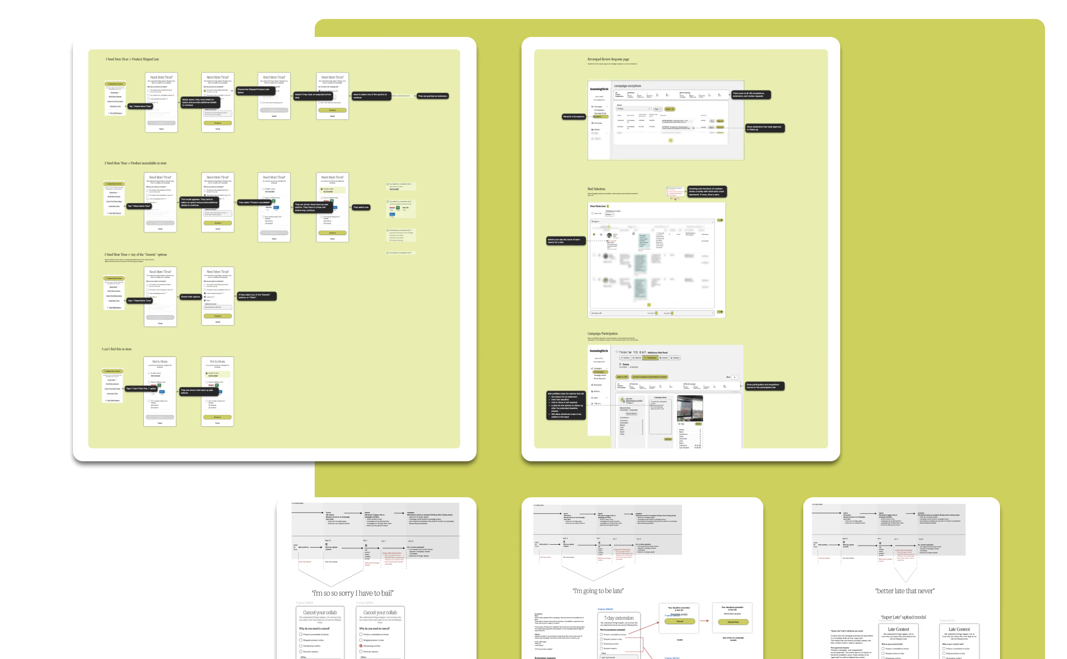
With the logic settled, I built each flow from the existing design system, adding components only where the system genuinely didn’t have an answer. The admin tool had one job: let someone make a good decision fast. Every review needed full context in a single view, no tab-switching. I mapped what was actually load-bearing for each decision type and surfaced only that: the request, pre-populated decision criteria, creator campaign history, and a one-click approve or reject with a required note. That note went to the creator and the brand platform automatically.
The creator flows all started from one entry point and branched by scenario. The same rules held across all five: acknowledge the request before asking for anything, collect only what’s needed to route or resolve it, and close every flow with a defined status, whether that’s resolved now, under review with an ETA, or escalated with a contact. Accessibility review happened during design, not at handoff. Dense internal tools fail on contrast and keyboard navigation, and both of those matter more when someone is moving fast in a low-attention environment.
Testing and Validation
Testing effort went where the behavior change was.Creator flows were straightforward. Five clear scenarios, one entry point, standard mobile patterns. They went into our regular user research calls and got tested the way any consumer flow would. Nothing surprising came back.
The admin side was the risk. Changing how someone does their job is harder than changing how someone uses an app once a month, and internal users are the ones most likely to get handed a tool without ever being asked about it. So I sat with all ten admins individually and ran the same task set against the new flows that I’d used to map the old ones: take me through a cancellation, an extension, a late product, a product that isn’t in this store, a product nobody nearby carries. I ran them as usability tests, with assigned tasks and no coaching.
The flows held up and nothing in those sessions sent me back to Figma. The genuinely useful result had already come out of the first round, when ten admins turned out to have ten different processes, which is the evidence that made the case for codifying the rules in the first place.
Engineering in the Room
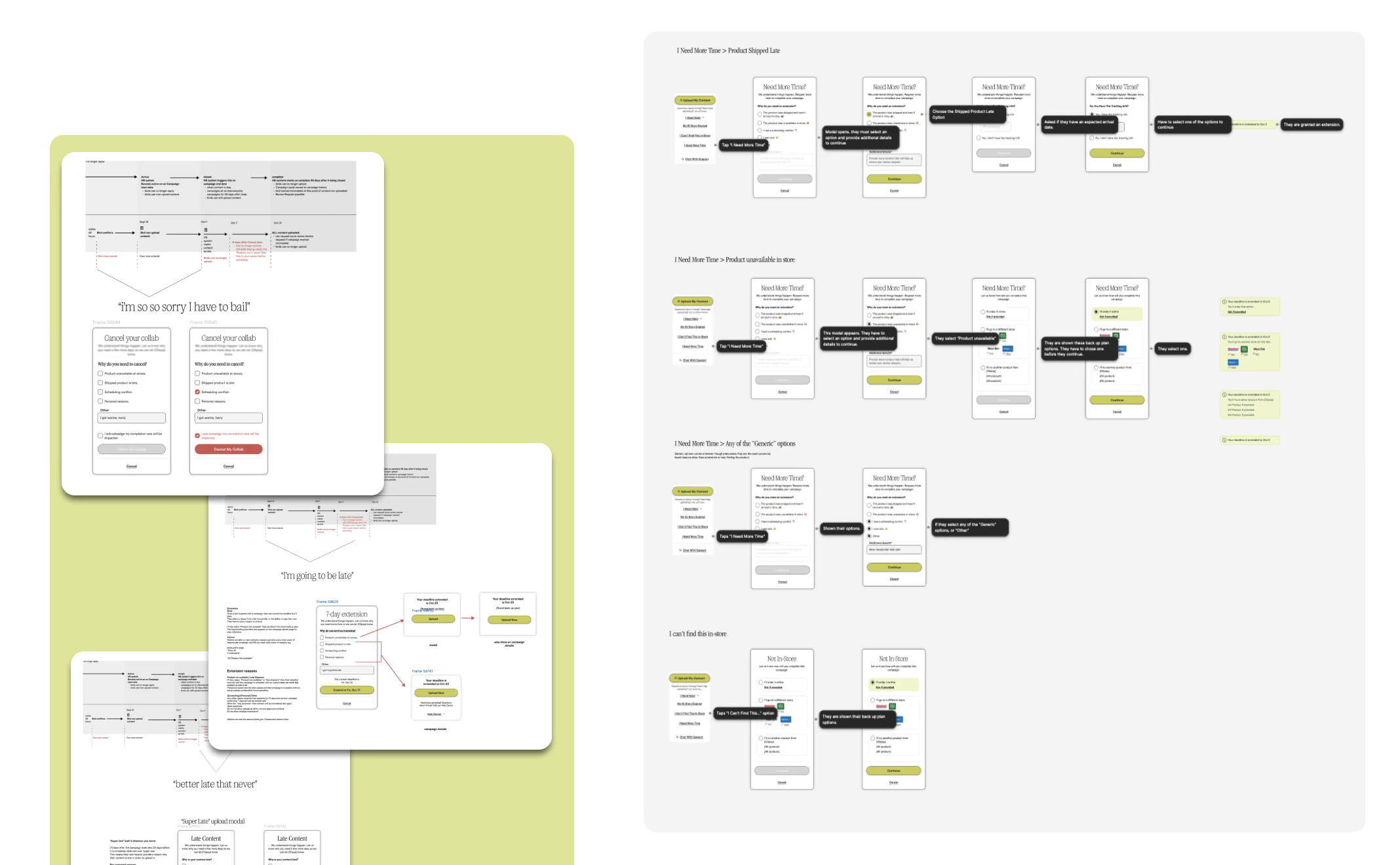
Every turn of the wheel got walked through with engineering: the system map, the decision logic, each surface as it developed. They pushed back and asked questions while the answers were still cheap to change. Removing the chat integration came out of one of those conversations, as did several smaller scoping calls about what the admin tool could realistically read from campaign state.
That’s also what made the documentation work. Every interaction, every fork in every flow, and every condition that changed behavior got written down. In a system where the same screen behaves differently depending on campaign state, the documentation is what makes the screens buildable, and it was reviewed by the people who would build it, as it was written.
Two Things That Didn't Resolve Cleanly
When the rules run out. Several scenarios never resolved into a clean yes or no, and forcing one would have stripped out the admin judgment that protects the brand relationship. The answer was approve/reject controls plus override capability for the edge cases, so the system resolves what it can determine and routes everything else to a person.
Getting the org to let go. Admins liked the new flow. Customer service leadership liked it on paper and were nervous about actually making the change, and CS had final say, so nervous was enough to stall it. The objection in the meeting was pace. It took a few more conversations to get to what was actually going on, which was content. A brand pays for a campaign up front. If creators cancel and nobody catches it in time, the brand is short on content it already paid for, and by the time that’s visible the window to get the money back has closed. Automating cancellation meant that could now happen faster, at scale, with no human watching it happen.
That was a legitimate fear, and it changed the design in a few places: * Cancellation stayed with admin review. It was the one scenario where preserving human judgment cost real throughput, and it was worth the cost. An admin sees every cancellation before it’s final. * Deadline proximity and campaign state moved into the admin review view. The person approving can see what this cancellation does to content delivery while they still have the decision in front of them. * Cancellations and extensions roll up to the brand platform as campaign health, not as individual notifications. A brand watching participation erode can add creators while there’s still time to do something about it.
Where It Landed
Alignment work with CS leadership was still in progress when I left the company. The project had not gone to engineering for build.
What existed at the end were design goals validated through usability testing and stakeholder review, a set of flows engineering had already pressure-tested, and something that hadn’t existed before: a complete, shared, written picture of how customer service actually worked and how it could work. * Admin tool — the workflow is automated where rules already existed and left with a person where they didn’t, and everything needed for a decision sits in the review view. * Brand platform — campaign performance, individual content and creator activity in one place, so brands could see the shape of what was happening without becoming responsible for managing it. * Creator mobile app — every customer service request begins and ends in the app. No external tools, no waiting on a human to notice.
I left before any of it got built, so I can’t tell you what it did. What I can tell you is that the next person to pick up customer service at Hummingbirds starts from a written system instead of ten people’s memories.