OfficeLuv
Shipping a complete office platform in four months
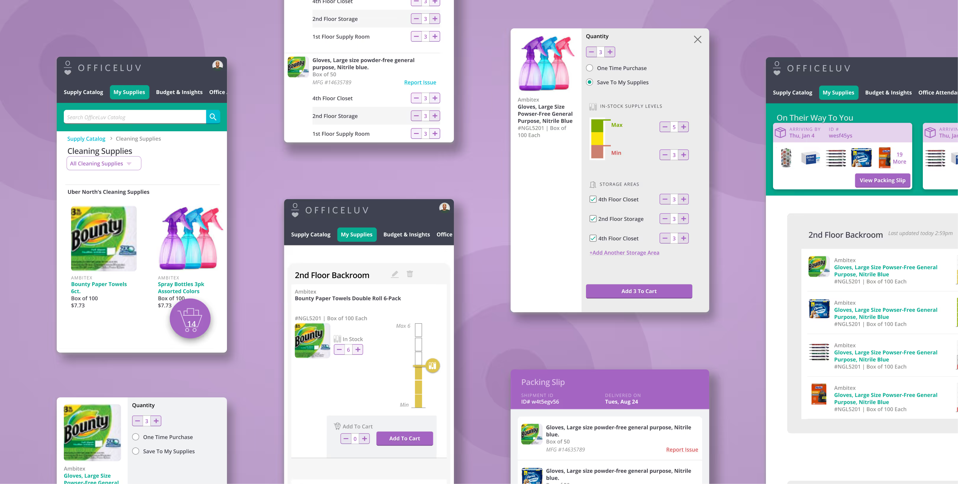
This project entailed the creation of an office management platform within a stringent four-month timeframe, necessitating close collaboration across various teams, including Engineering, Product, Account Management, and Product Requisition.

Design Strategy
Scope First. Everything Else Second (Don't Go Chasing Waterfalls)
Before any design work started, we had to be explicit about what we were building and what we weren’t. A four-month runway doesn’t leave room for scope creep. We defined the core use cases, agreed on what was out, and held that line.
It’s not a glamorous part of the process. But it’s why the product shipped.
User ResearchDesign Sprints
The Time Was Expensive, and More Than Worth It
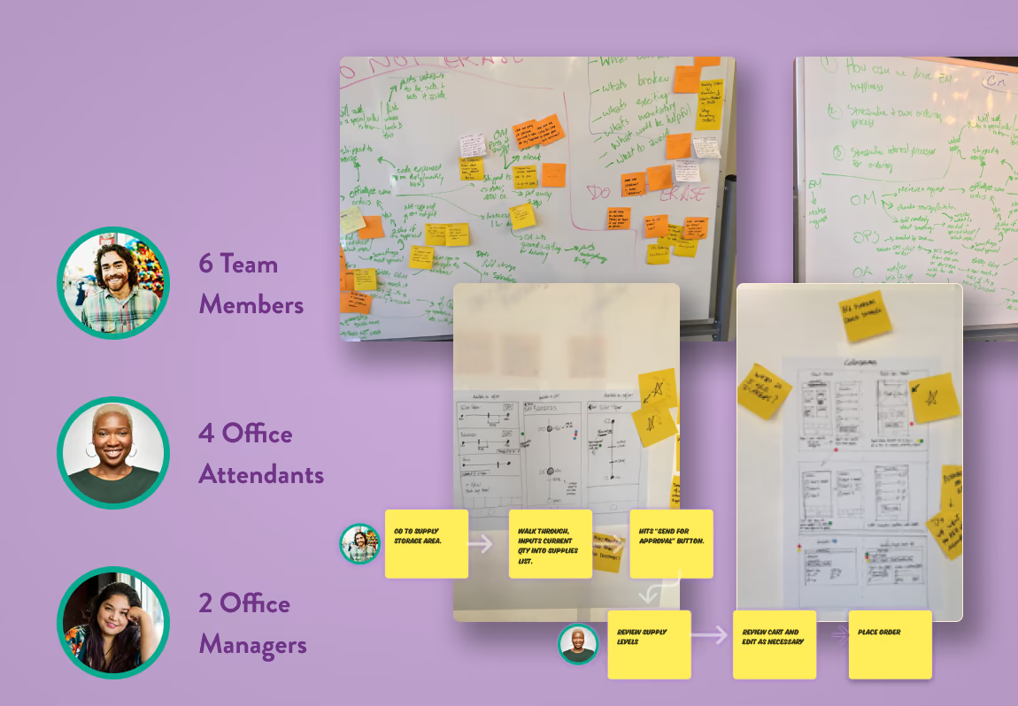
We ran design sprints with the full team. Engineering, product, and a handful of real clients. The goal wasn’t consensus for its own sake. It was getting everyone in the same room with the same information so that the decisions that followed were grounded in how offices actually operated, not how we assumed they did.
UXUIVisual Design
The Price Is Right
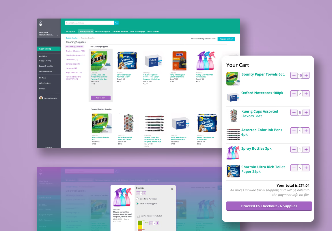
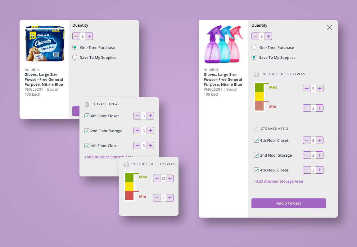
One of the more interesting calls: we cut prices from the cart entirely.
Standard e-commerce pattern says show the cart total. But office managers weren’t using the cart to evaluate cost. They were using it to confirm they hadn’t forgotten anything before submitting. The price wasn’t relevant to their job in that moment. Showing it was just noise.
Cutting it made the interface faster and clearer. It also reinforced that the product was a management tool.
UXUIVisual Design
Two Jobs To Be Done One App. Zero Overlap.
The supply management workflow had to serve two distinct people using it in two completely different situations.
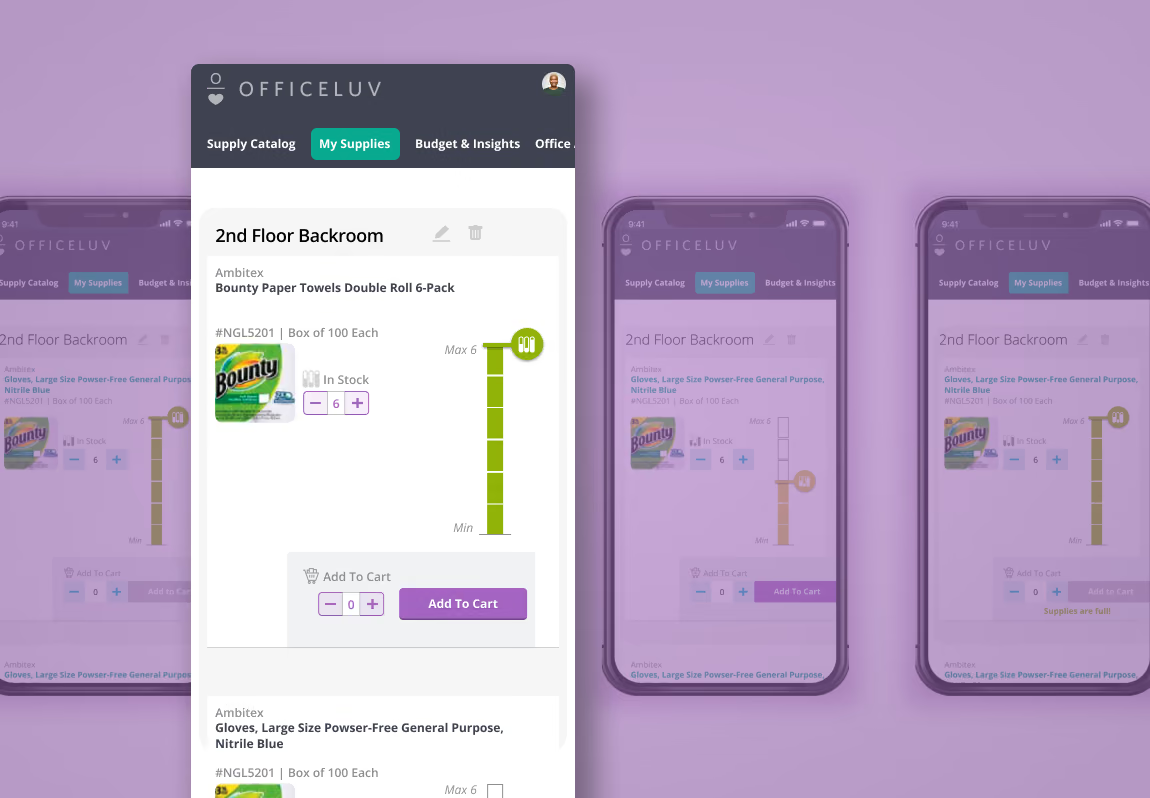
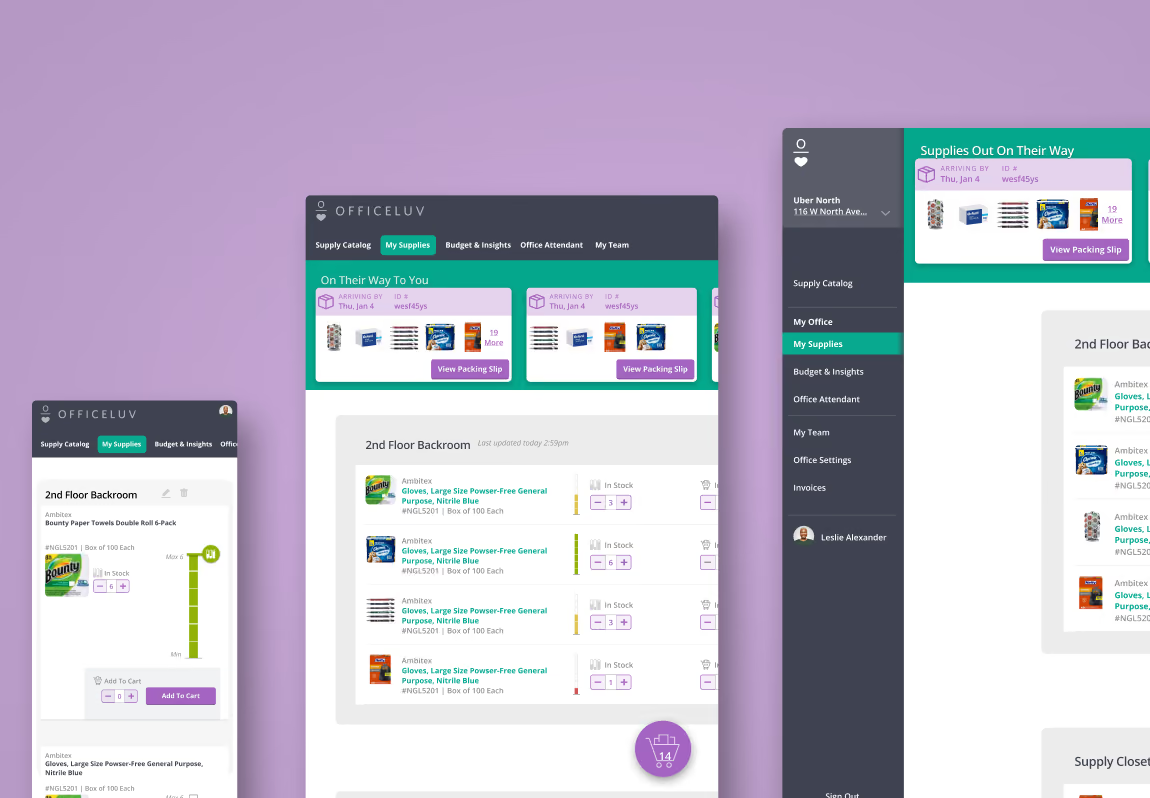
Office Managers reviewed supply levels from their desks, looking across multiple locations at once. Office Attendants updated levels from their phones while walking the floor and taking inventory. Same underlying data. Completely different interface needs.
The mobile supply slider was designed specifically for one-handed use. No keyboard, no typing, just a physical gesture that matched the physical act of checking a shelf. The desktop layout prioritized breadth: multiple locations visible at once, approvals without drilling in.
Responsive design was about who was holding the device and why.
UXUIVisual Design
One Component, Two Jobs
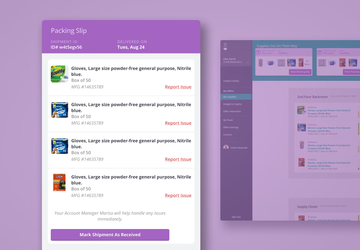
A key value proposition of OfficeLuv was connecting supply-level management directly to reordering. So when something ran low, the path to restocking was already there. That required purchasing and supply management to coexist in the same UI without fighting each other.
The design components were built to carry both contexts. Reusable, consistent, and clear about which job they were doing at any given moment.
UXUIVisual Design
Context Matters
The supply level UI came down to one question: what does this person actually need to do, and where are they when they’re doing it?
Office Attendants weren’t sitting at a desk. They were walking the floor, phone in one hand, clipboard or supply cart nearby. A number input requires stopping, tapping a field, summoning a keyboard, and entering a precise count. It adds friction at exactly the moment the user has the least patience for it.
But the deeper issue was precision itself. Supply management isn’t an exact science. “Low,” “about half,” and “we’re good” are about the mental states an attendant is navigating. A number input implies an accuracy the job doesn’t require and the context doesn’t support. The slider mapped directly to how people were actually thinking about the problem. It was faster, one-handed, and eliminated a category of decision-making that was never useful to begin with.
Shipped On Time
We shipped to roughly 100 customers inside four months. On deadline, with a product that covered the full scope we’d committed to. No quiet descoping, no “phase two” placeholder features. The full office management suite: supply ordering, usage tracking, automated reordering, task delegation.
That outcome was a direct result of how we ran the project. The team — one PM, three engineers, one designer — had already worked together for a year before this build started. The trust was already there. We weren’t spending cycles re-establishing working norms or relitigating decisions. We knew how each other thought, which meant we could move fast without moving recklessly.
The PM ran prioritization tightly. Scope clarity at the start. Agreement on what we were and weren’t building gave everyone permission to say no to additions without it becoming a political event. That discipline is what made the four-month timeline real rather than aspirational.
19th Nervous Breakdown (What I'd Do Differently)
The sprint process worked well for alignment, but we front-loaded stakeholder involvement and then tapered it. In retrospect, a lighter but more consistent check-in cadence through mid-build would have caught one or two late-stage feedback loops earlier. The product shipped clean, though a few decisions near the end required more iteration than they needed to.