Hummingbirds
Growing signups with a rebuilt onboarding flow
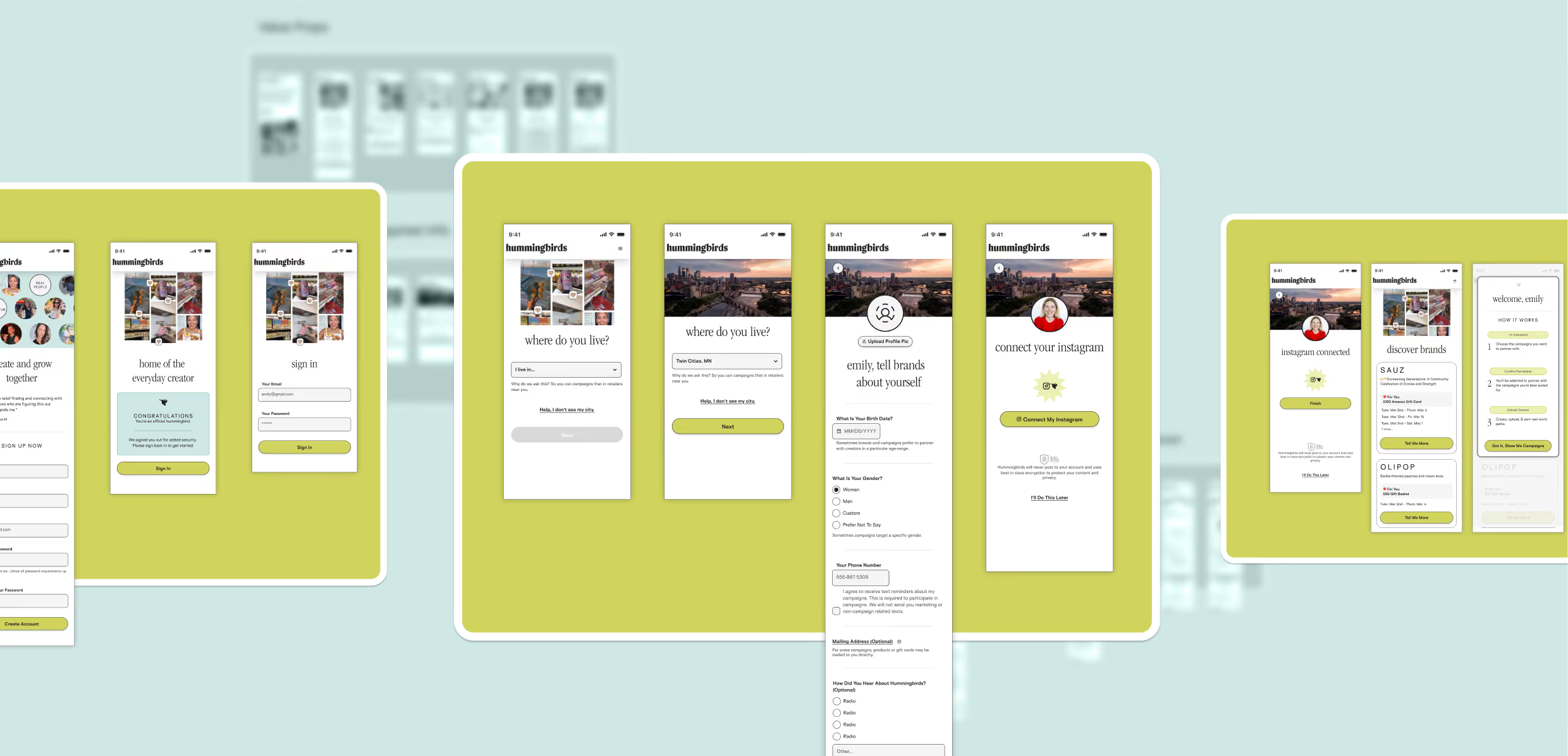
Hummingbirds connects brands with local content creators. People who post about the neighborhoods, restaurants and shops they actually go to. The pitch is good: work with brands you already like, keep your creative voice, get paid. The original onboarding flow opened with a form. Sign-up numbers reflected that, and I was brought in to fix it.
What Every Field Was For
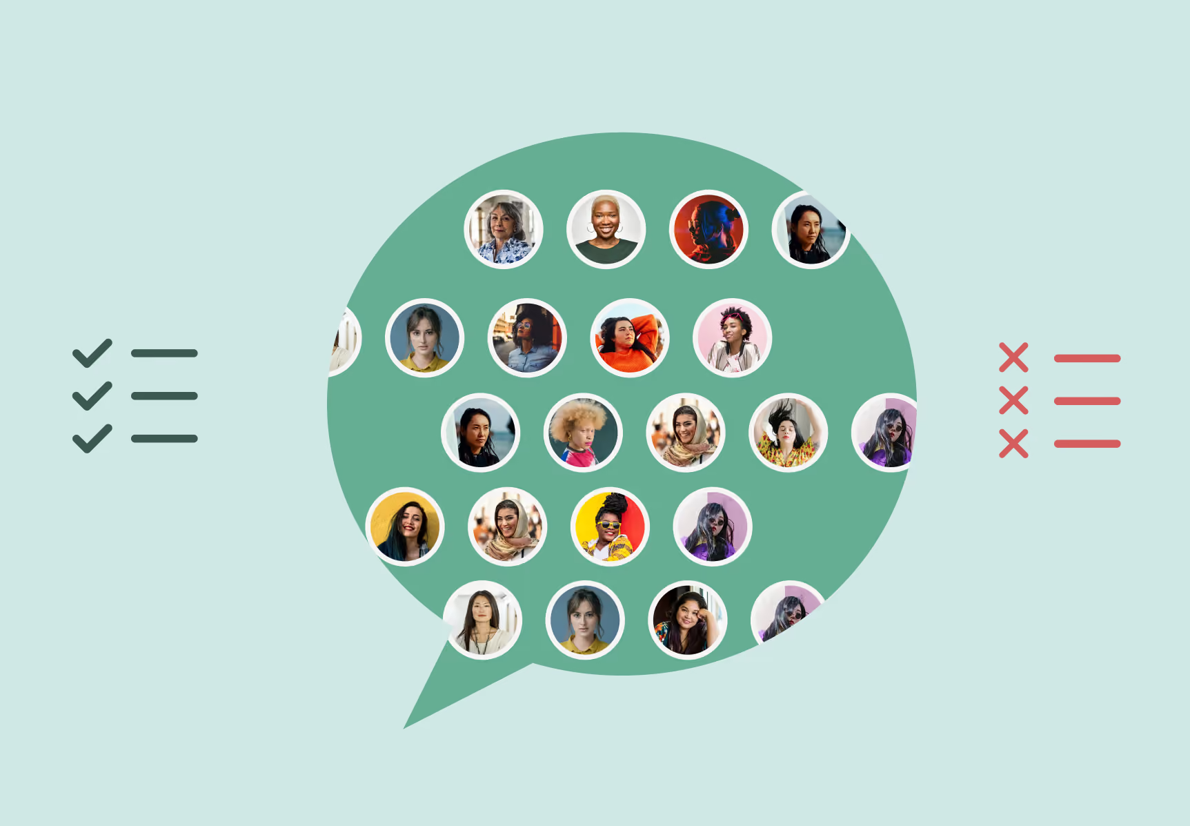
Every field on that form was there because somebody had asked for it, and I wanted to know who and why before proposing we cut any. So I started on the business side. Co-founders, head of community, anyone downstream of the data. Same question every time: what breaks if this is empty?
Phone powered SMS. Campaign alerts, deadline reminders, most of the operational contact with an active creator. Age and gender fed brand matching. Brands specified who they wanted reaching their neighborhood, and without those fields a creator couldn’t be matched into anything. Home address let brands ship product samples and gift cards.
I asked engineering a different version of the same question: what do you actually need to create an account and run a campaign? Those two answers didn’t always agree, and the disagreements were the interesting part. Phone and demographics were load-bearing on both sides. Address was the odd one out. Engineering confirmed it wasn’t required to open an account or run a campaign, but some campaigns did need it, which meant it couldn’t simply be deleted either. I lobbied to move it out of onboarding and onto the account page, collected the first time a shipping campaign came up.
I got half of that. It stayed in the flow, marked optional, with copy saying so. The other half of the answer had to live further down the user flow: a creator who skipped it needs to be asked again, in context, at the moment a brand wants to mail them something. That’s an edge case I wouldn’t have found without engineering in the room early, and it was the reason to keep them there for the rest of it.
Then I Talked to Creators
Interviews, surveys and usability sessions with 25 creators, before I touched a screen. I asked about the tools they were already using too — what they’d adopted, what they’d quit, what they were working around. Creative freedom came up first and loudest: the ability to make the thing in their own voice, rather than execute somebody’s brief. Local brands mattered nearly as much. Places they’d recommend anyway, not national names.
The worries were just as consistent. Connecting Instagram to a platform they’d never heard of was the big one, and underneath it sat a quieter question about whether the creative freedom they’d been promised would survive contact with an actual brand.
Both showed up in the same conversations, a minute apart. That set the order of operations: earn some trust before asking for anything.
Where the Gate Goes
Hummingbirds wanted the data collected before letting anyone through. On paper that’s reasonable. More fields, more matching, more brands served.
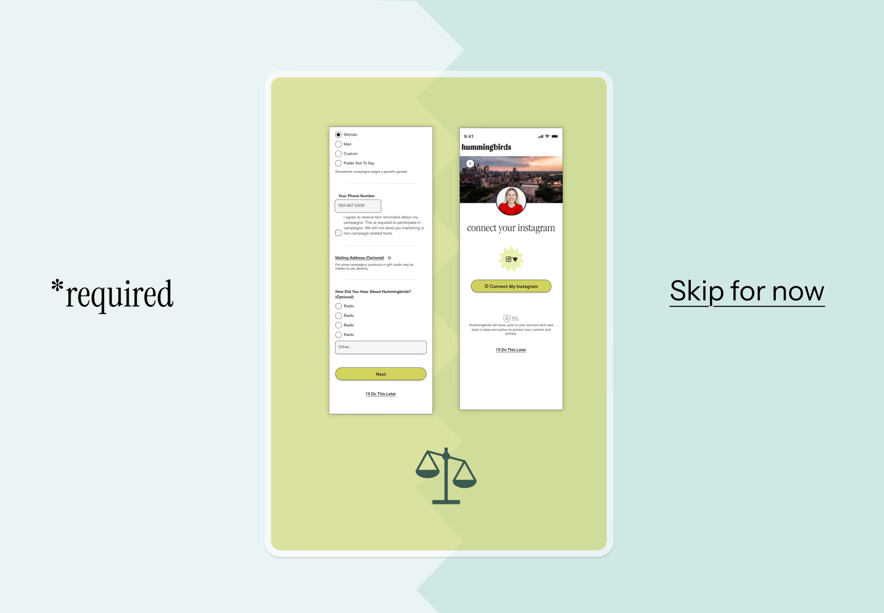
I pushed back. A creator who doesn’t yet understand why Hummingbirds is worth their time will not hand over a phone number. They’ll leave. You don’t get more people through the door by holding entry hostage. So I proposed letting creators skip everything except name and email, with one condition: to see actual brand listings, the thing they came for, they’d have to finish. The objection was that we’d collect less data from the wrong people. My argument was that we’d collect more of it from people who stayed.
That only holds if the data that matters survives the move. Instagram connection was the field the business couldn’t operate without. No connection, no matching, no campaign. After the change, connection rate held while completions went up.
Break the Flow Into Four Chunks
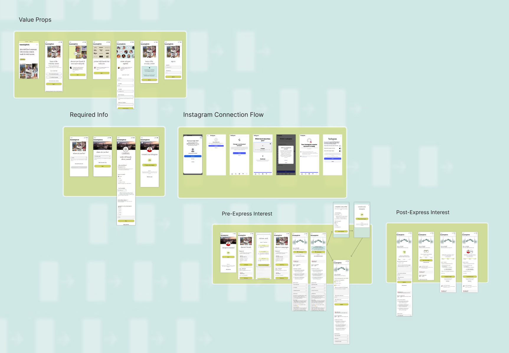
I split the flow into chunks with a single job each, so I had a test for whether a given screen belonged.
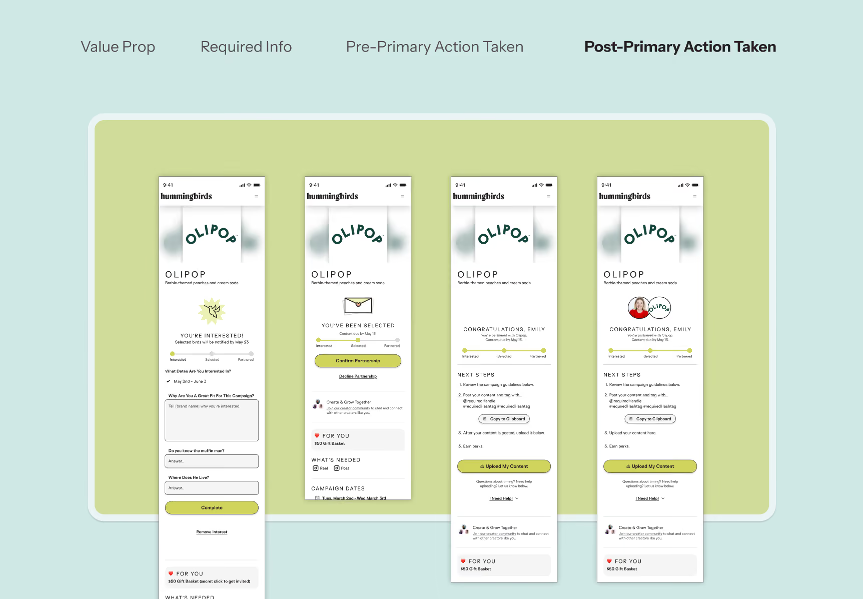
The pitch. Brand logos, creator voices, a clear picture of what the product is. One job: make the case. The ask. Phone, demographics, Instagram connection, landing after a creator has seen the product and decided they’re interested. Every field carried microcopy explaining what it was for, pulled straight from the founder and engineering conversations. The orientation. The job changes from convincing to explaining. A walkthrough of the core loop: find a brand, create content, get paid. The next step. After a creator expresses interest in a brand, the flow lays out what happens next at ground level, so interest has somewhere to go.
Breaking It Down
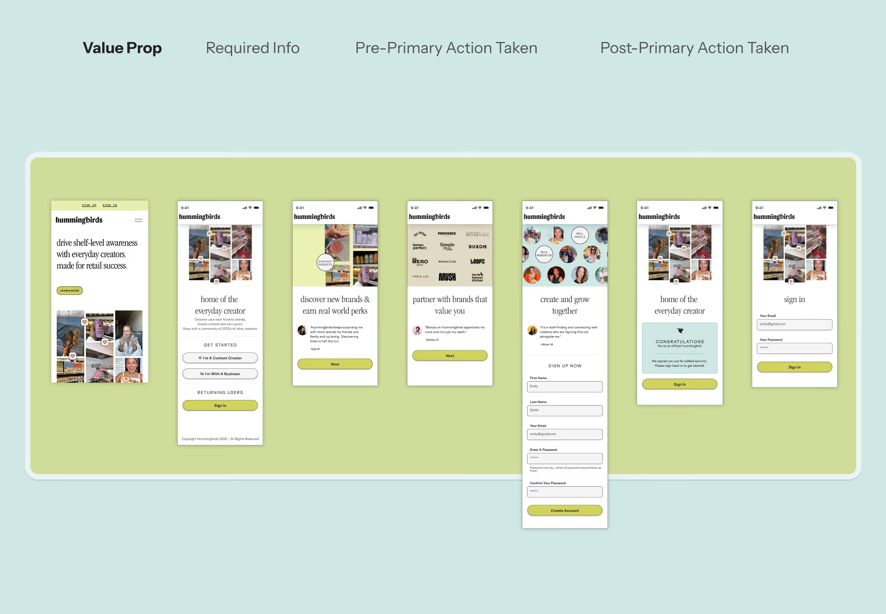
Before designing a single screen, I mapped the entire flow into discrete chunks, each with a distinct job.
The pitch
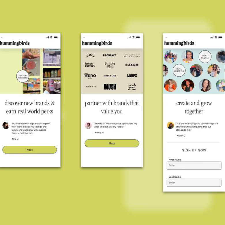
The pitch lives here. A creator who doesn’t understand why Hummingbirds is worth their time won’t hand over their name, let alone their Instagram. This chunk does one thing: make the case. Brand logos, creator voices, and a clear picture of what the product actually is.
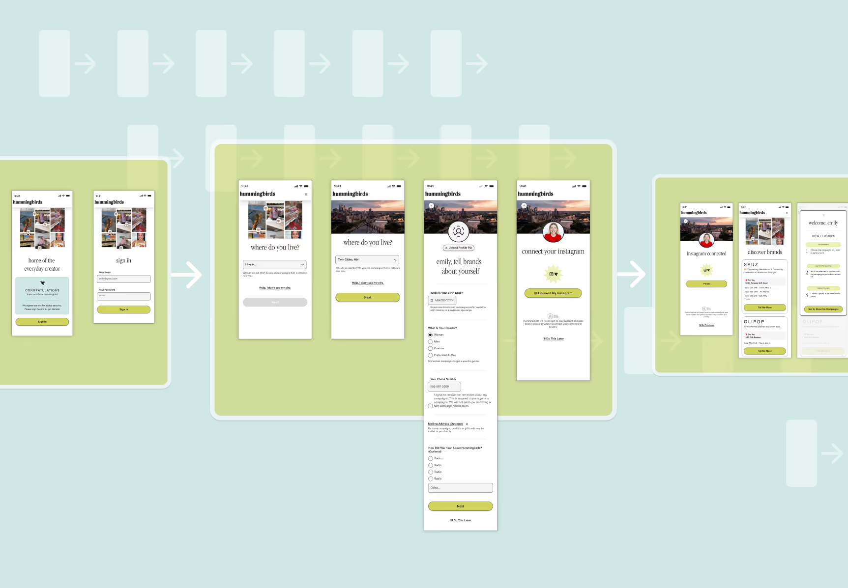
The ask
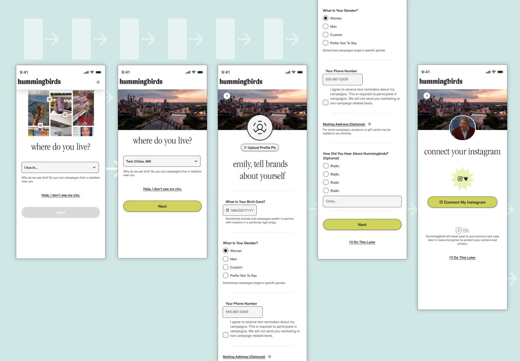
The harder asks — phone, demographics, Instagram connection — land here, after a creator has seen the product and decided they’re interested. Context matters: every field carried microcopy explaining exactly why we wanted it and how it would be used. The security callout lived here too, placed right at the moment of maximum hesitation.
The orientation
Once someone’s through, the job shifts from convincing to orienting. This chunk introduced the core loop — find a brand, create content, get paid — and set up the empty states to keep the momentum going until the product had something real to show.
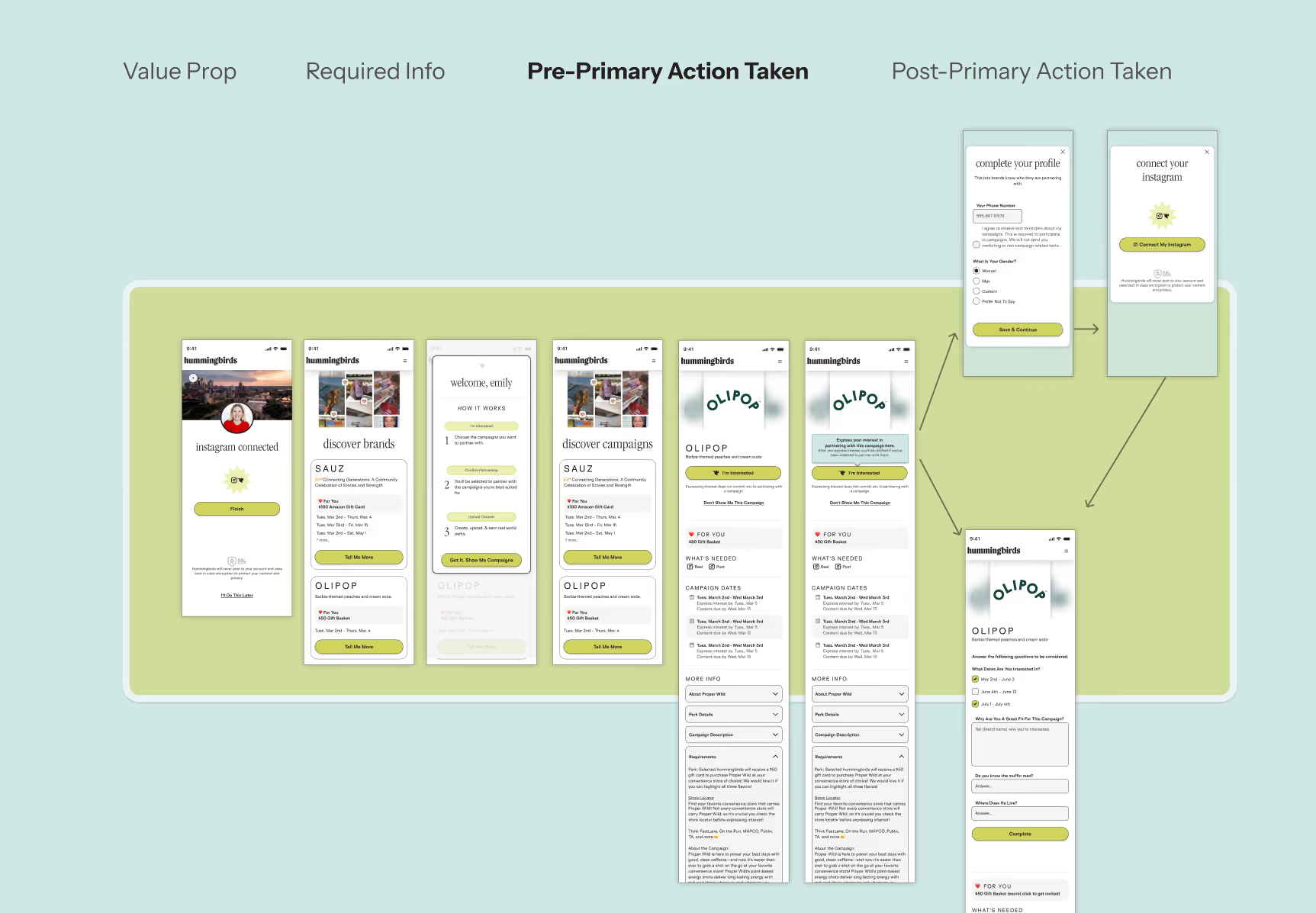
The next step
Once they Express Interest in a brand, we switch to helping understand what comes next in the process at the ground level.
Tactics at the Friction Points
Once the main chunks had been identified, a handful of UX tactics to reduce the friction in getting peoplethrough the flow.
Step one was a sell
Brand logos and a row of creator avatars made the case before the flow asked for anything, so it read like a community that already existed.
Straight from the creators’ mouths
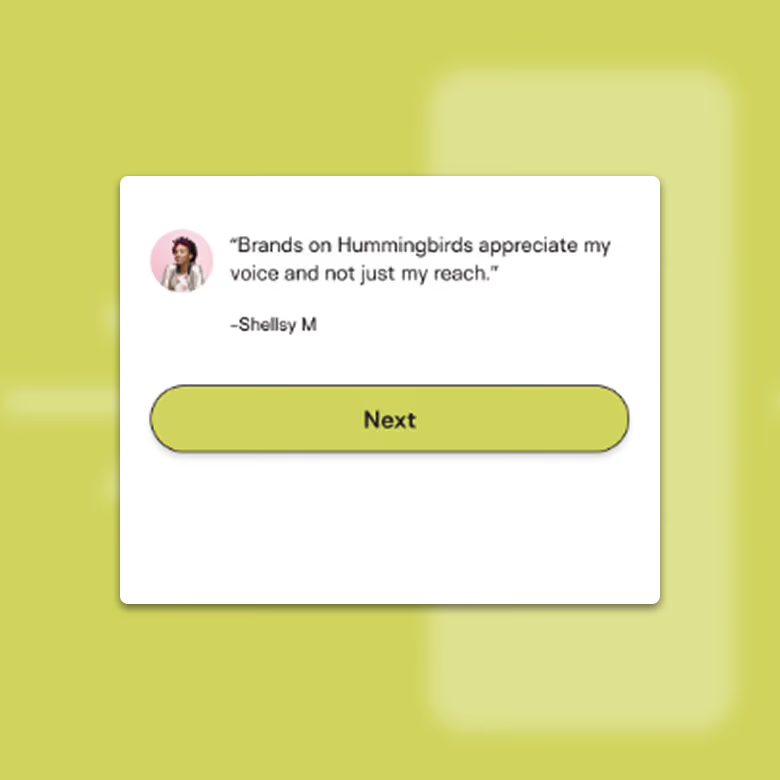
Creators’ own words from the research. Creative freedom came up so consistently that it became the lead message rather than a supporting one.
Easy asks first
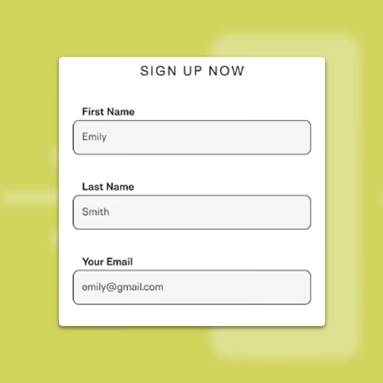
Name and email first: low commitment, familiar, fast. City next, because local matching is the entire product.
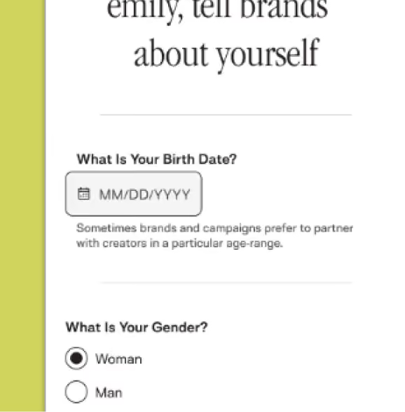
Harder asks, explained in the moment
Phone, gender and age each explained at the field itself, not buried in a policy page nobody opens.
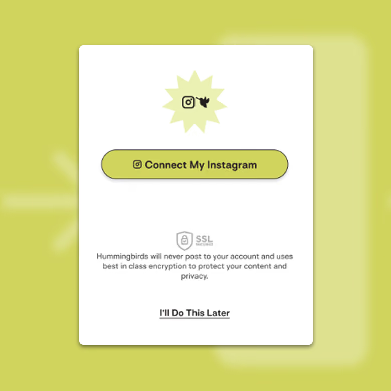
Security, right where the hesitation lived
Instagram was the biggest ask and the loudest worry, so the security callout sat beside the connect button instead of three screens earlier.
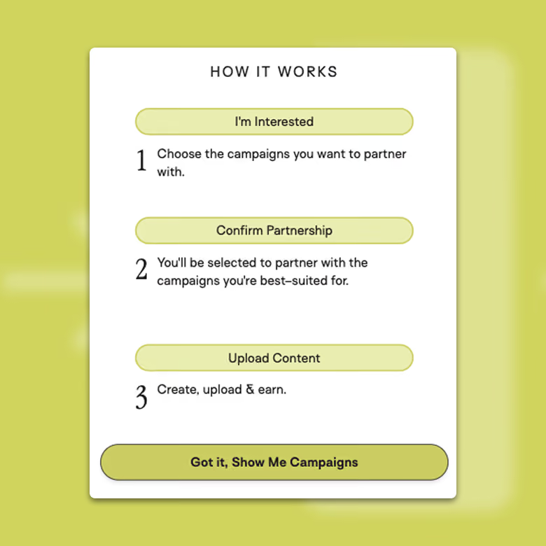
A real introduction, not a tooltip tour
The best error state is one a creator never sees, so most of this went into making them unnecessary — validation at the field, formats accepted rather than rejected, and a clear recovery path on the Instagram connection, which was both the likeliest step to fail and the most expensive one to fail on.
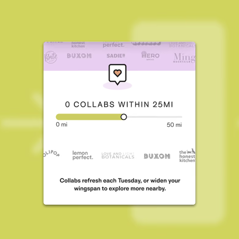
Empty states as a second onboarding layer
Where the detail nerd got to play. No search results, no active campaigns, no earnings yet, each one treated as continued onboarding: here’s what fills this, and here’s your next move. The scaffolding stayed up until the product had something real to show.
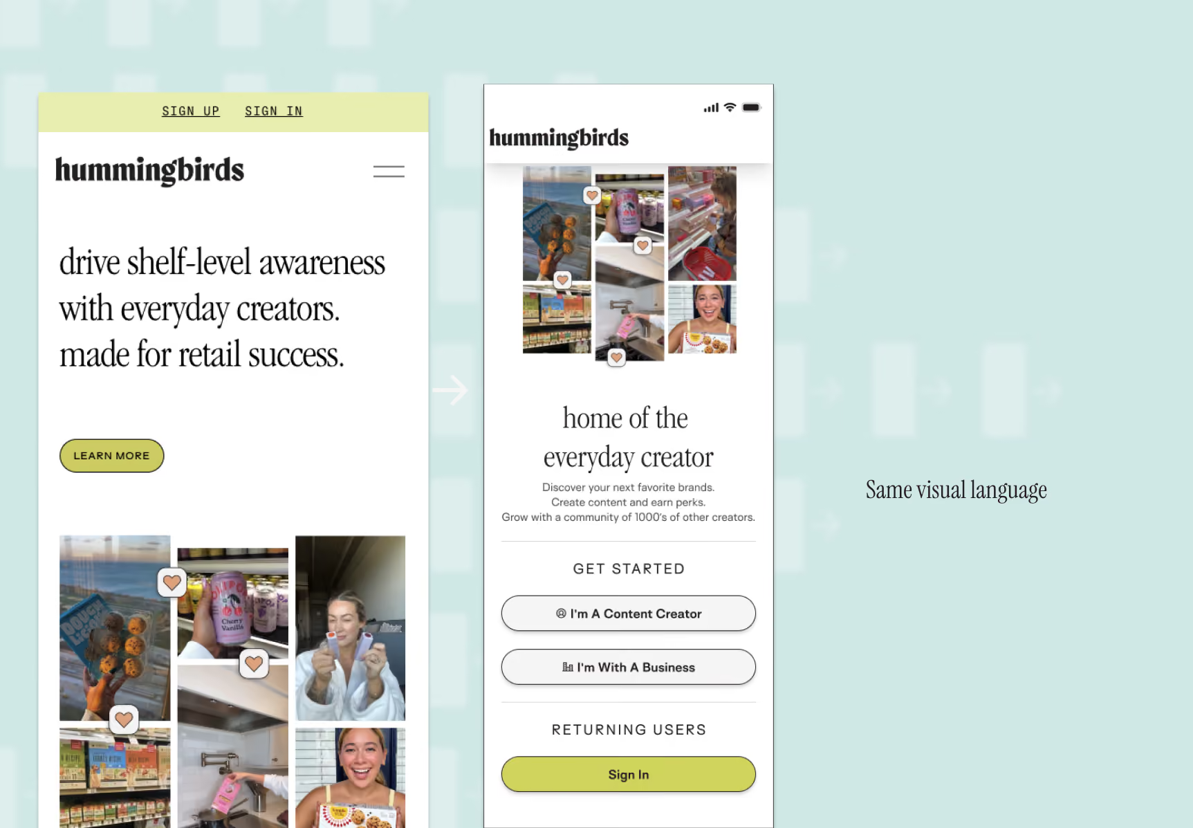
Bringing in the Brand Designer
A creator’s first impression of Hummingbirds happens on a marketing page. The second happens in the product. Designed by two people who never spoke, the creator feels the seam even if they can’t name it. Visual continuity was a stated goal. Getting the two teams working together to produce it was my call. I’d watched marketing and product drift apart at Grubhub and knew roughly what it costs.
The brand designer owned the landing page and the visual language around it. I took elements from that work and proposed how each should behave once it became product. A marketing section and a product screen have different jobs, and lifting one directly into the other gives you something that looks right and works badly.
Sprints, After the Draft
The sprints came once I had a full draft, which was deliberate. Sprints that start on a blank wall generate options, and I didn’t need options. I needed to know what was wrong with what I’d already built, and people respond faster and more precisely to something concrete.
I opened them past the usual stakeholder set to anyone in the company who wanted to contribute. Some of what I was after lives with individuals rather than roles. The person answering creator emails all day knows things the founders don’t, and won’t volunteer them in a status meeting.
Most of what came back was small. Copy that read wrong, visual details, a handful of UI corrections. Cheap to fix, which is the point of running it at that stage.
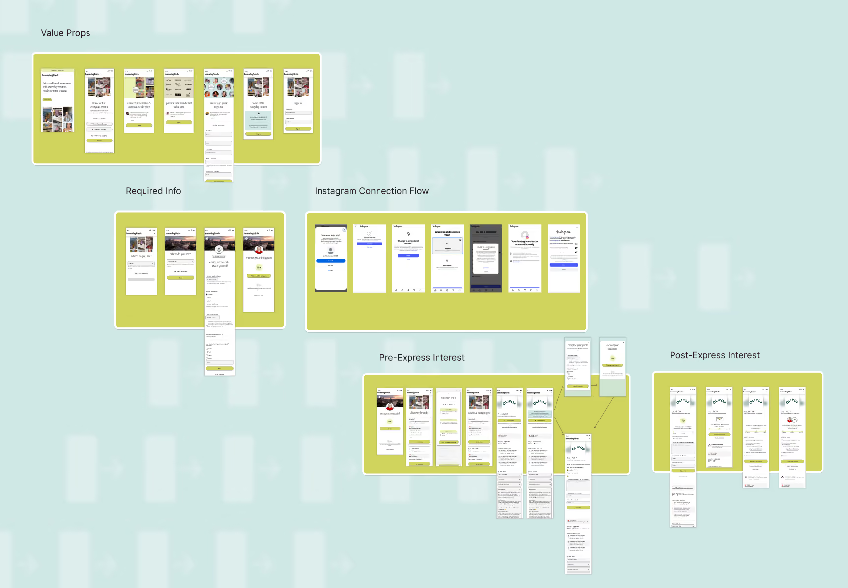
Prototypes in Front of Creators
I built the final flows as Figma prototypes and put them back in front of creators. This was less about task success than about the two things the earlier research surfaced: did the security explanation land at the moment they felt the hesitation, and did they come away believing the creative freedom was real.
You can measure a completion rate after launch. Whether someone understood what they were agreeing to is only observable in a room.
The Argument I Lost
Mid-build, HubSpot requirements surfaced. Several data points had to be captured up front, before the skip. Which was the thing I’d spent the previous month arguing against. I made the case again, same reasoning, now with research behind it. I lost. The integration was a hard dependency and the timeline wasn’t moving.
The mistake was in my discovery. I’d mapped what the business needed and what engineering needed, and never asked what the company’s own tooling needed. HubSpot wasn’t a product requirement. It was a marketing operations requirement, sitting in a category I hadn’t thought to interview. Third-party tooling now gets mapped alongside the rest.
What shipped is still mostly the flow I argued for. Creators get in on a name and an email, the pitch comes before the ask, and Instagram connection sits past the point of intent. The first step is heavier than I designed it. Lost that battle, won the war, which is not the worst trade available.
What Happened
New sign-up completions rose 24% over the prior flow. Instagram connection rate held. Two caveats, and both change how you should read those numbers. Measurement design. This was pre/post, not an A/B test. We didn’t have the traffic to split a test cleanly, so both figures carry the same confounds: traffic mix, seasonality, whatever marketing ran that quarter. That applies to the flat connection rate exactly as much as it does to the 24%, and the flat number is the one my argument actually rested on. Depth. Hummingbirds was seed stage and the analytics were seed stage with it. I can tell you that more creators finished sign-up and that the field the business couldn’t operate without held its rate. I can’t tell you what those creators did afterward. Activation, first campaign, retention — that instrumentation didn’t exist yet, and I’d want it before making a bigger claim than the one I’m making. My argument was about holding data quality among the people who stayed. The evidence supports it as far as the evidence goes.