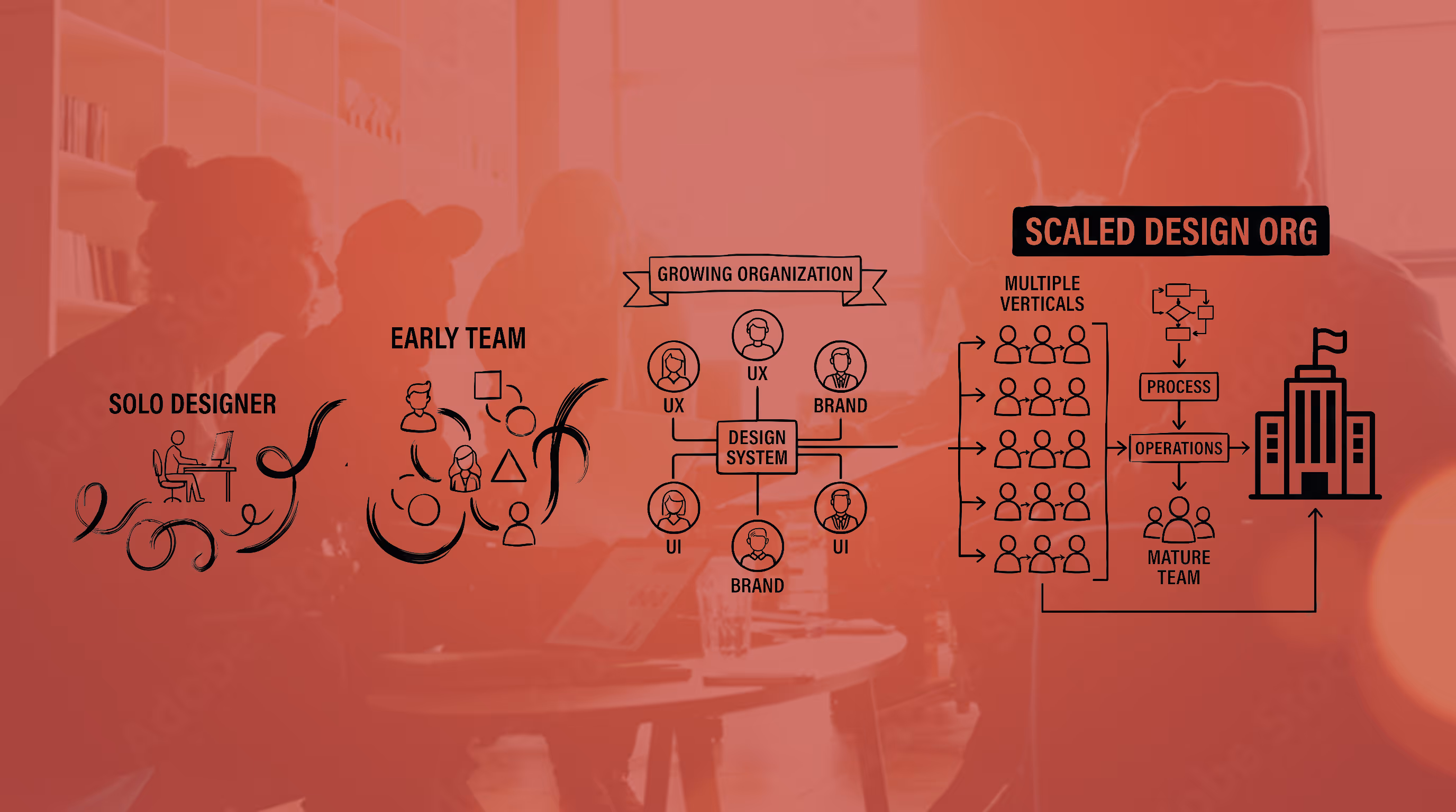
UX • UI • Visual Design
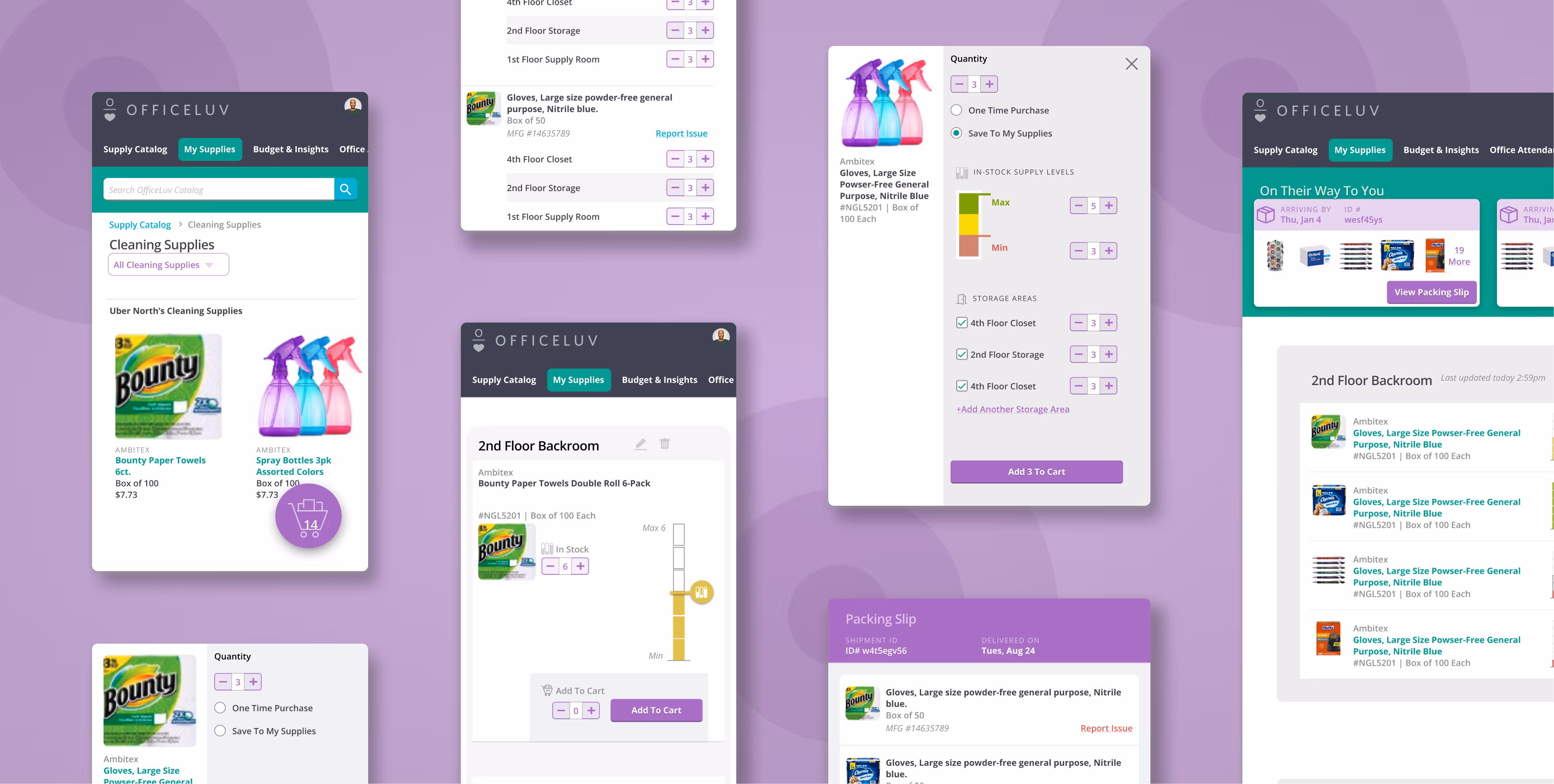
The supply level UI came down to one question: what does this person actually need to do, and where are they when they're doing it?
Office Attendants weren't sitting at a desk. They were walking the floor, phone in one hand, clipboard or supply cart nearby. A number input requires stopping, tapping a field, summoning a keyboard, and entering a precise count. It adds friction at exactly the moment the user has the least patience for it.
But the deeper issue was precision itself. Supply management isn't an exact science — "low," "about half," and "we're good" are the real mental states an attendant is navigating. A number input implies an accuracy the job doesn't require and the context doesn't support. The slider mapped directly to how people were actually thinking about the problem. It was faster, one-handed, and eliminated a category of decision-making that was never useful to begin with.