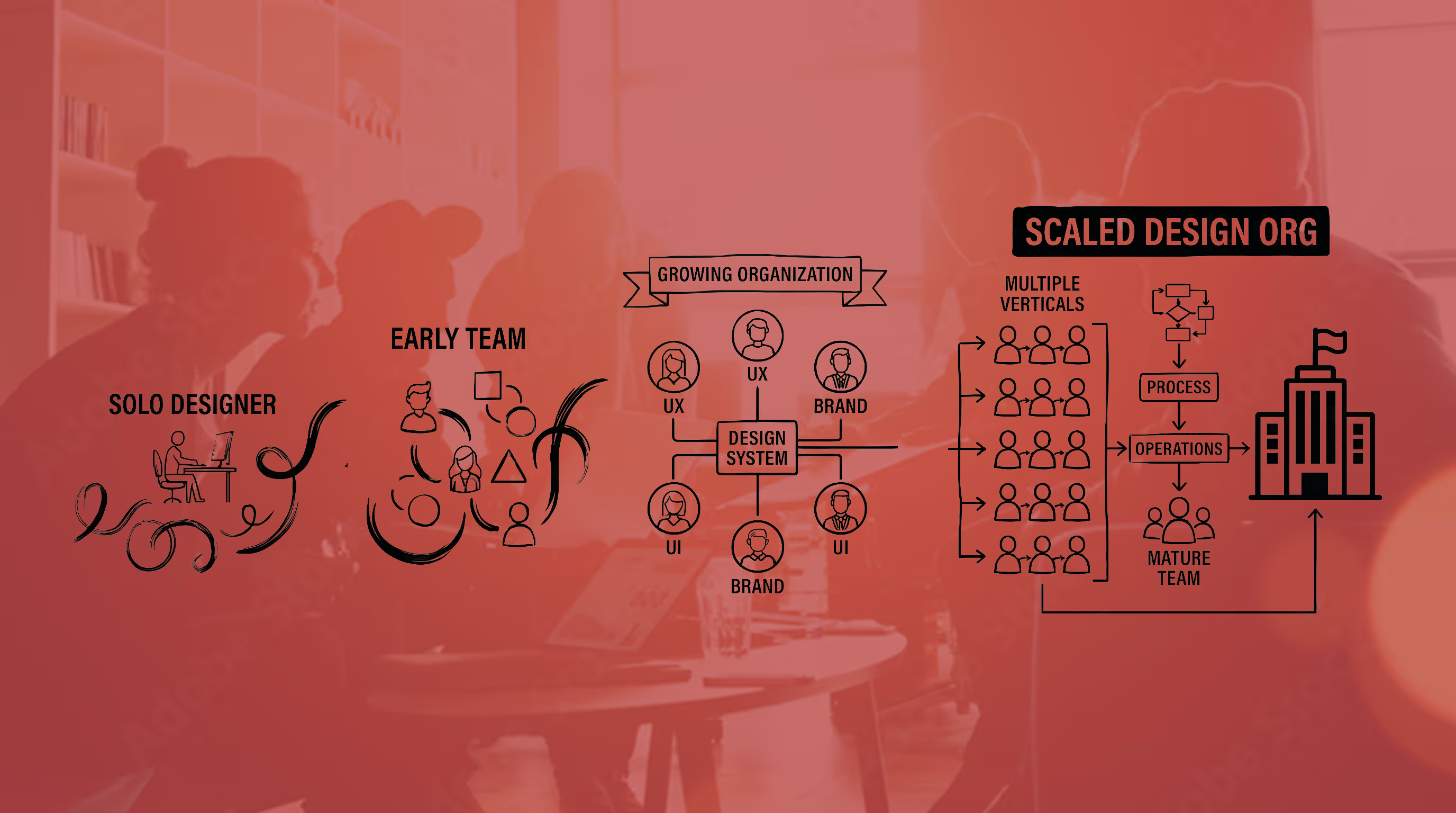
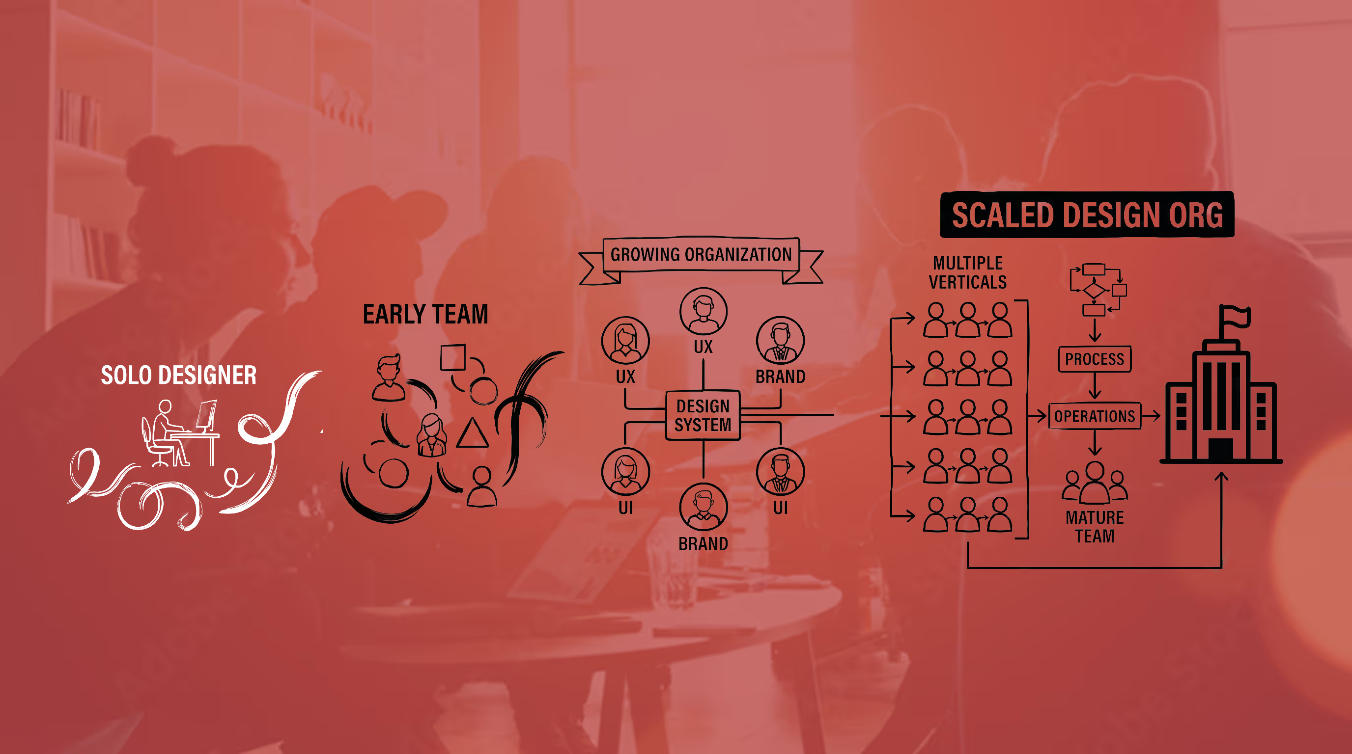
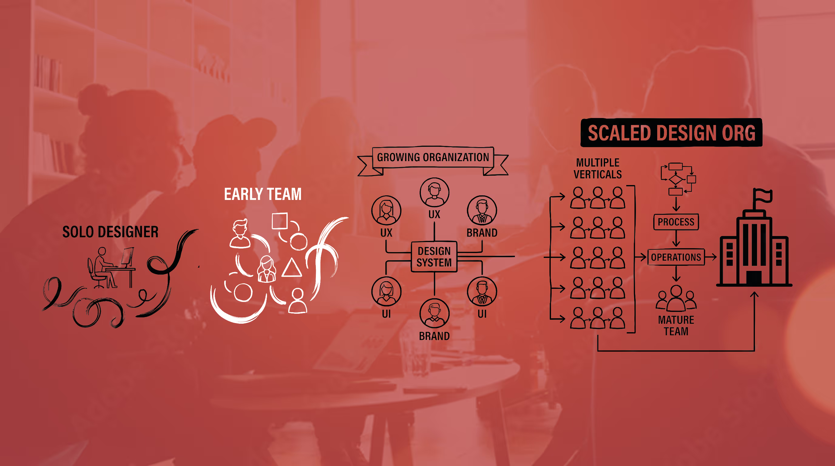
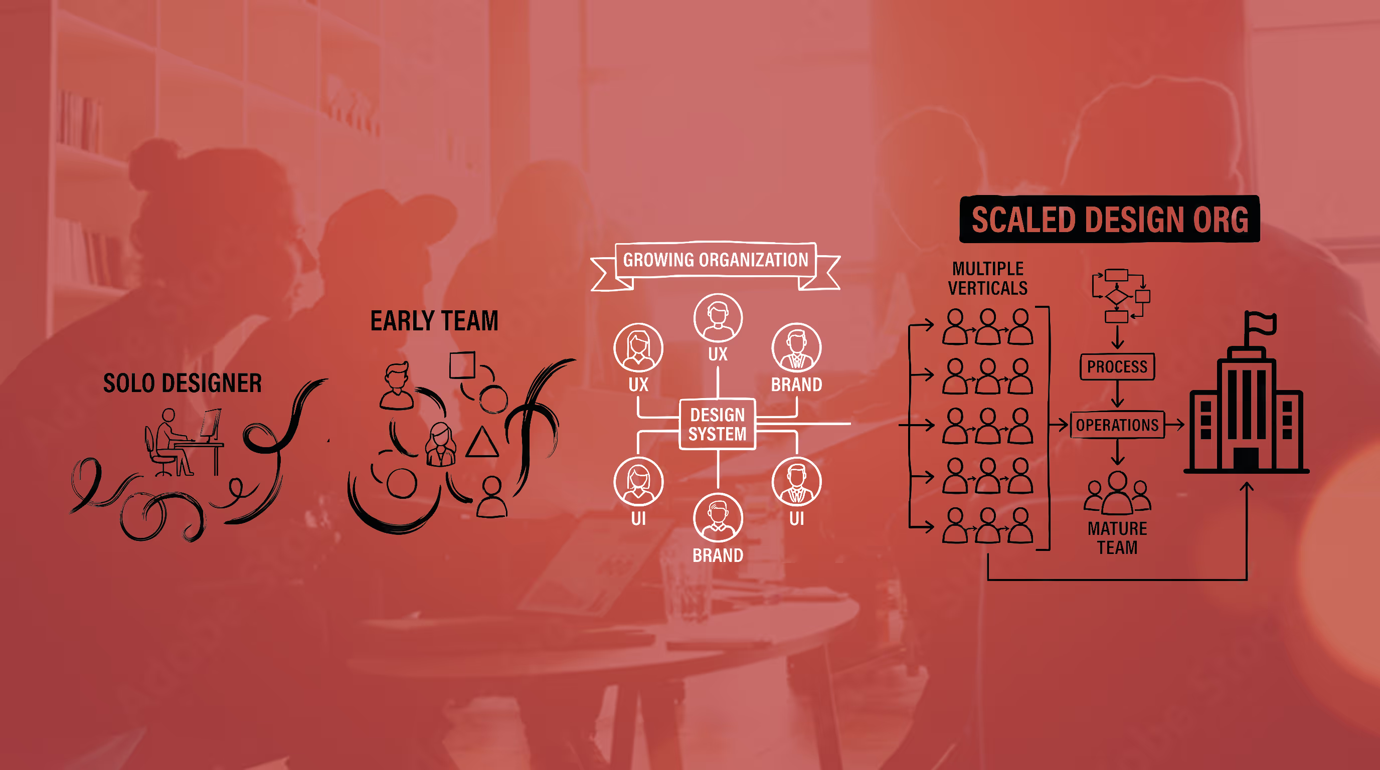
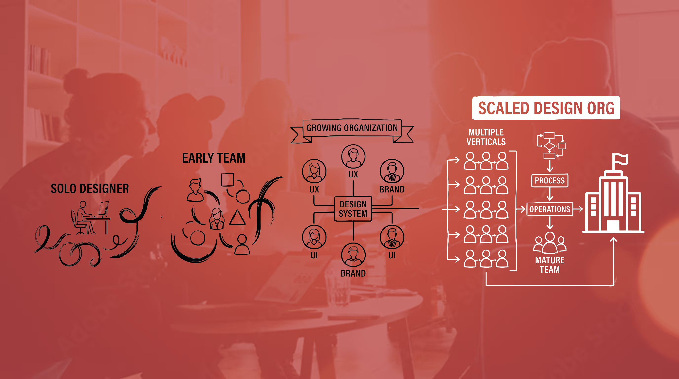
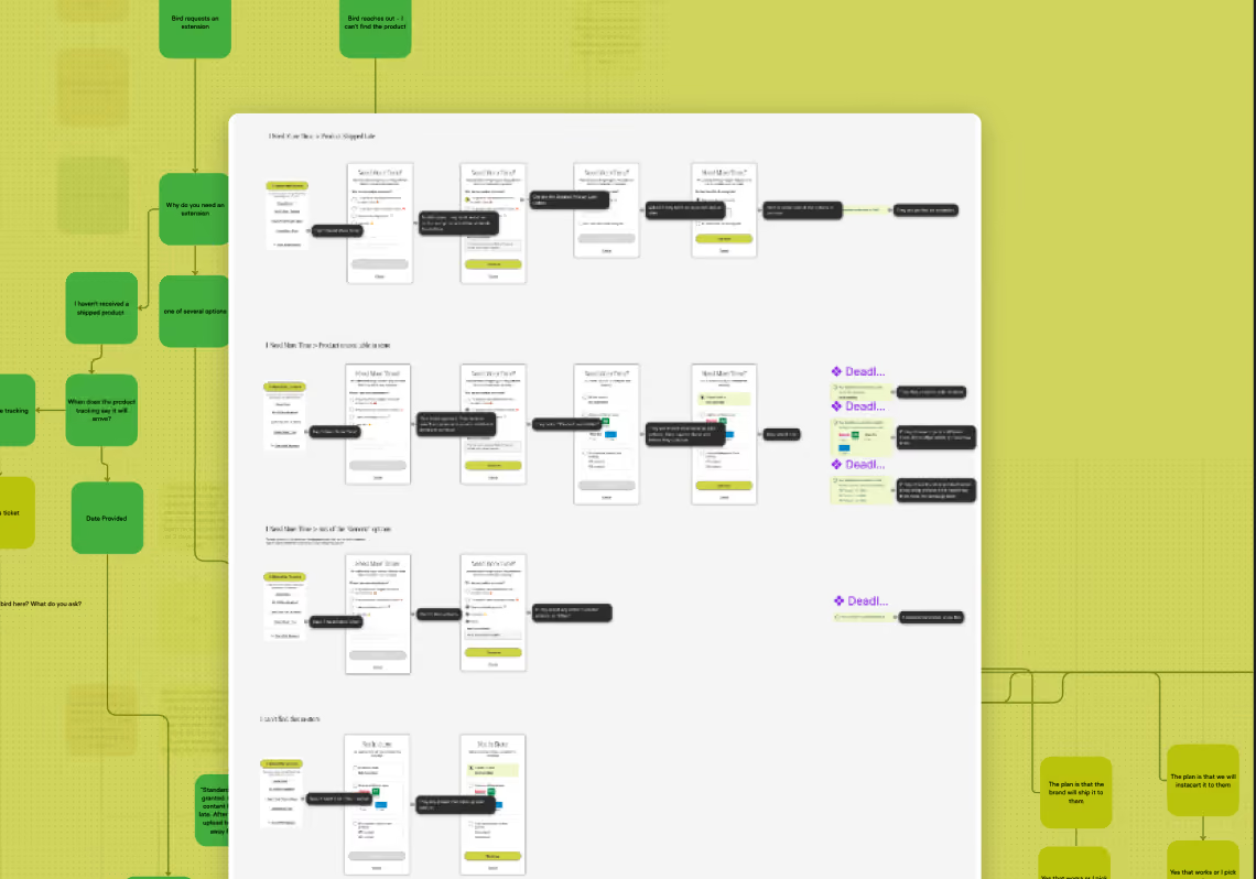
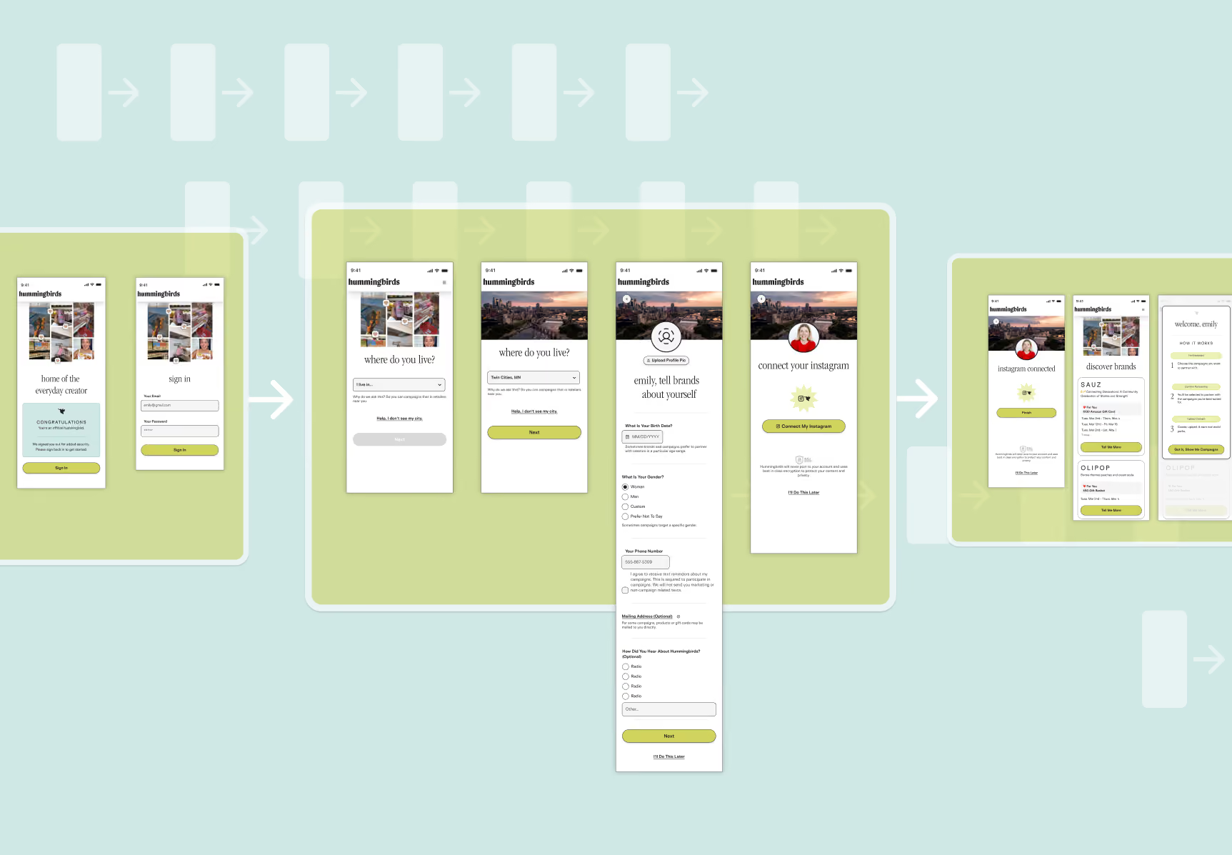
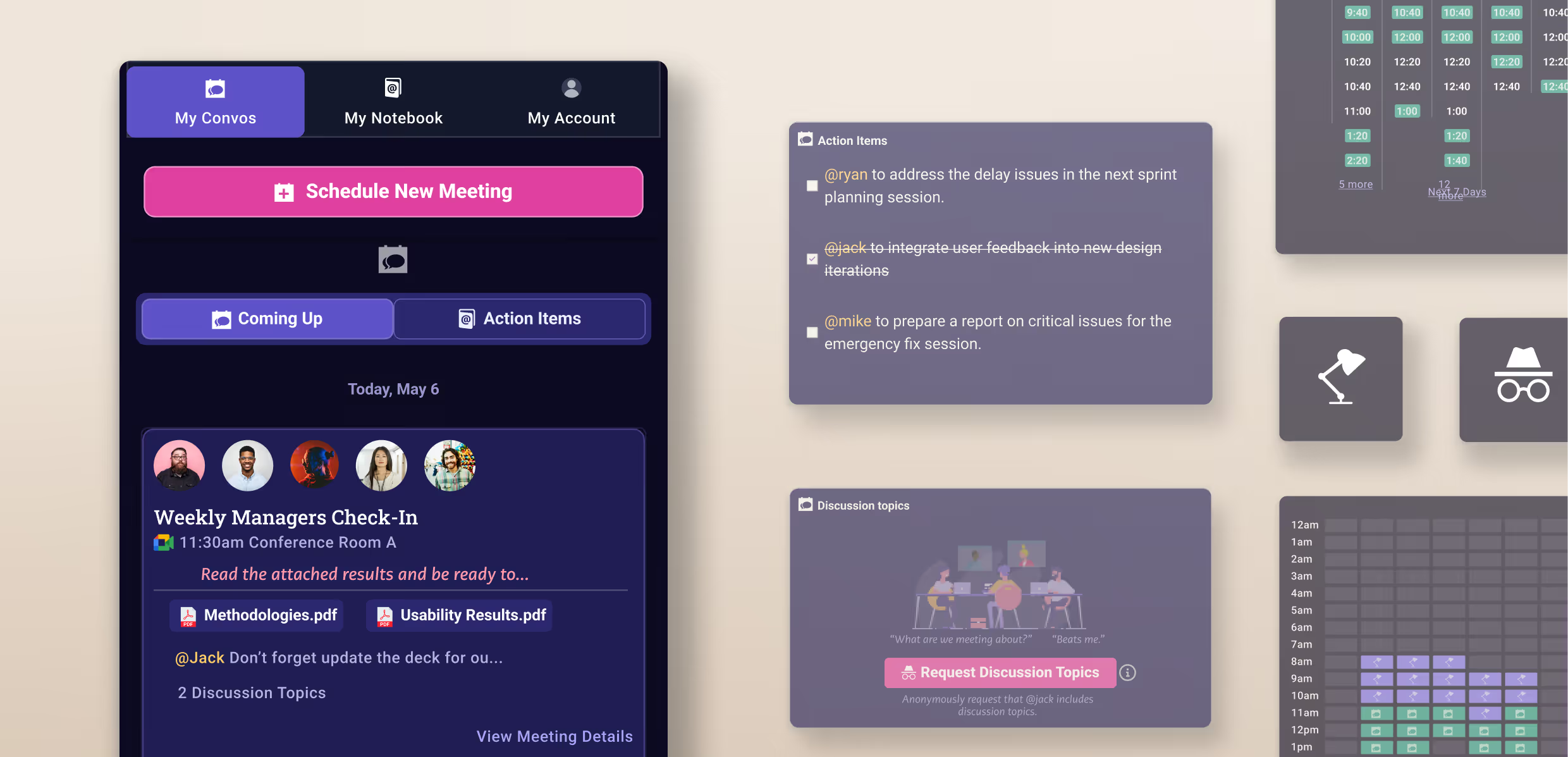
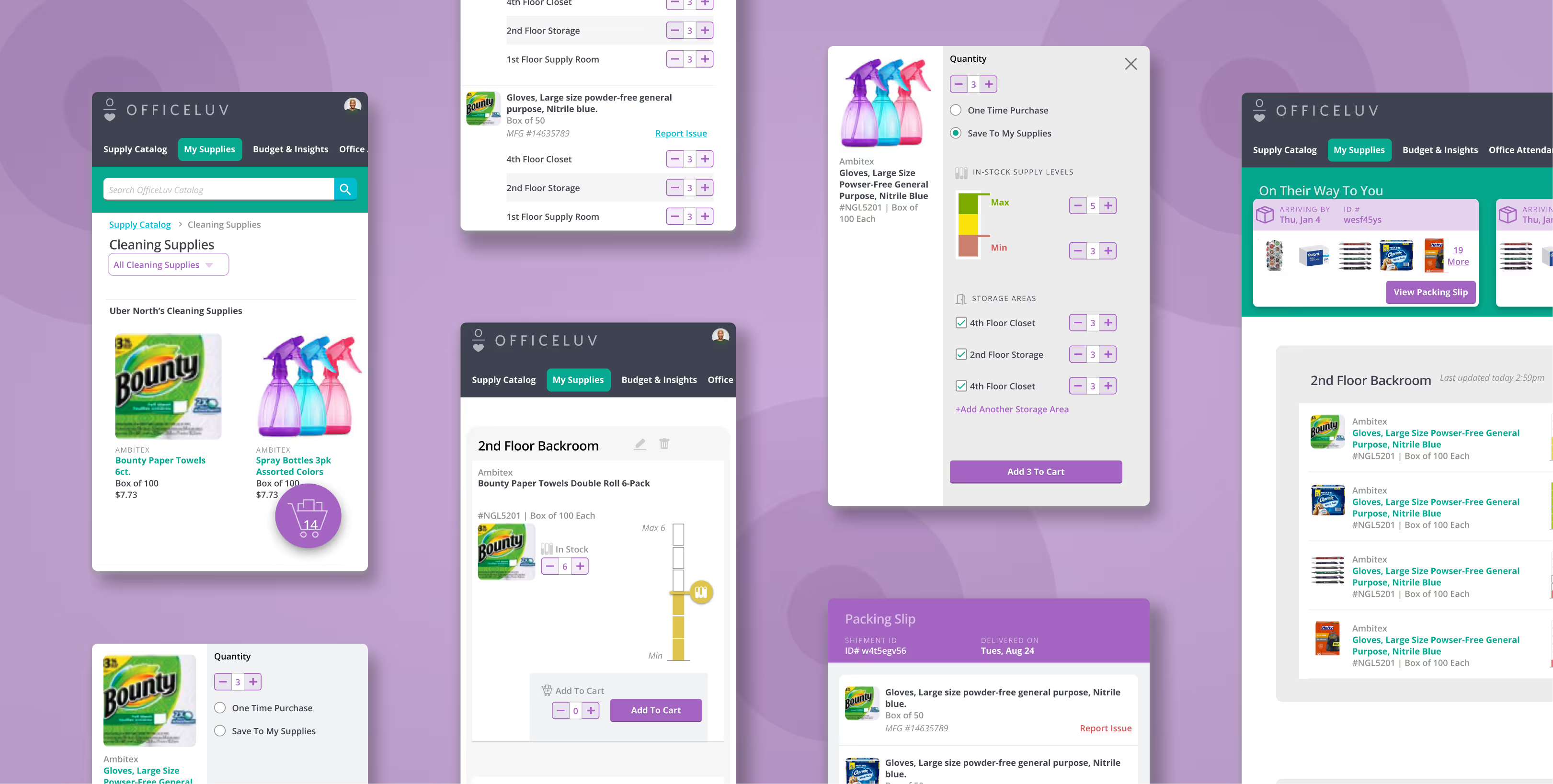
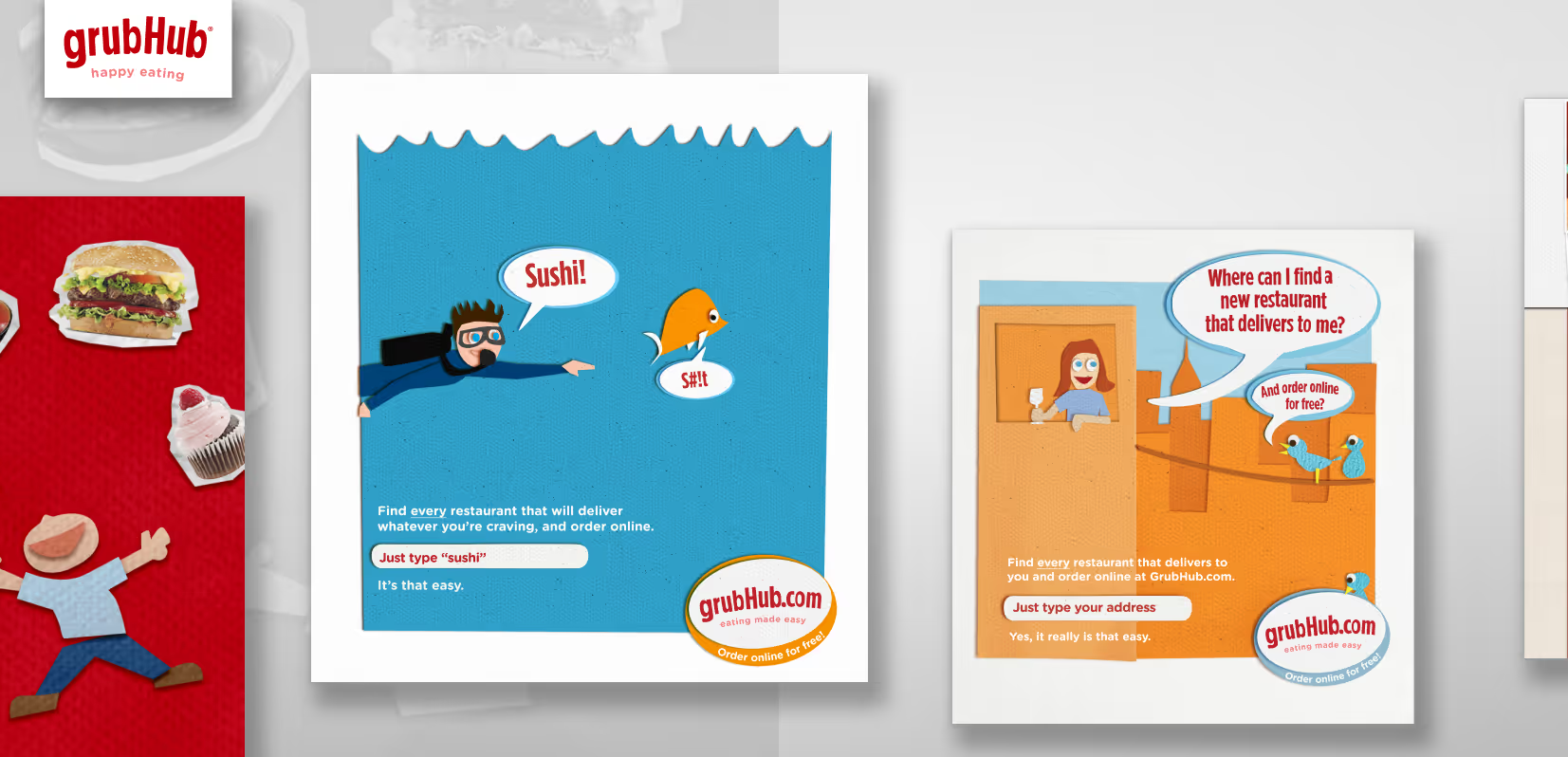
Pod structure. Designers were embedded in product pods, each aligned to a specific area of the product. This made designers genuine members of their cross-functional teams rather than external contributors who showed up to take a brief. As verticals became more distinct, roles narrowed — one UX designer and one visual designer on mobile, another pair on internal tools.
Cross-team cohesion. Pod structure creates efficiency and silos in equal measure. To address the silos, we ran regular lunch-and-learns between product and marketing designers — not formal presentations, just open show-and-tell. The goal was shared aesthetic vocabulary and the kind of familiarity that makes critique honest instead of careful.
Design critiques. Structured around improving work, not approving it. Whatever came out of critique was a prompt to consider, not a directive. Critique as command creates defensive designers. Critique as conversation creates better ones. This distinction — between a culture of feedback and a culture of approval — is one of the things I kept consistent as the team grew.
Resource allocation and prioritization. With two branches running simultaneously, I was constantly making trade-offs — who works on what, what gets deprioritized, when to escalate. The operational work of running a design org is unglamorous. It's also the thing that determines whether the team can do good work at all.
The design system. It grew alongside the team, not ahead of it. By the time we hit scale, the system held more than UI components and color specs — it included brand tenets and design principles, the layer that explains why decisions looked and felt the way they did. That's what keeps a design system from becoming a component library people quietly work around when it's inconvenient. It was also the foundation that made unifying two distinct design systems after the Seamless merger achievable at all.