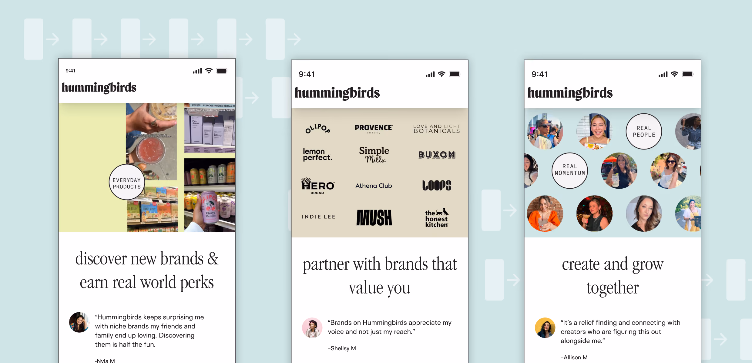
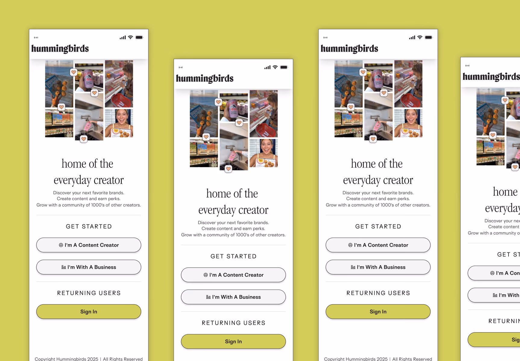
The Sign-up Worth Finishing
  • Lead Product Designer
  • Summer 2025
  • User Interviews
  • User flows
  • Prototyping
  • User Experience
  •  
H
ummingbirds connects brands with local content creators — people who post about the neighborhoods, restaurants and shops they actually use. The pitch to creators is genuinely good: work with brands you already like, keep your creative voice, get paid. The original onboarding flow wasn't making that case. New creator sign-ups reflected it. My job was to fix that. I owned this end to end — research, flow, UI, copy, and the calls that came with all of it, including the ones the business didn't love.
What User Research Confirmed
Before touching any screens, I ran usability tests, surveys and one-on-one interviews with 25 creators. Two things came back clearly.

What they wanted: creative freedom, and brands that matched their actual life. Not big-box national names — local places they'd recommend anyway.

What they were worried about: security (connecting their Instagram to an unknown platform) and whether they'd actually keep creative control once they signed up.

Those two tensions — excitement and hesitation — became the design problem. The flow needed to earn trust before it asked for anything.
The Decision The Room Argued About
Hummingbirds needed personal data to match creators with brands. Brands wanted it. The business wanted it collected before letting anyone through. On paper, reasonable: more fields, more matching.

But I pushed back. A creator who doesn't yet understand why Hummingbirds is worth their time will not hand over a phone number. They'll just leave. You don't get more people through the door by holding entry hostage.

So I proposed letting creators skip everything except name and email — with one condition: to see actual brand listings, they'd have to finish.

Let them in and see the entire app. The moment curiosity kicked in and a creator wanted to see who they could actually work with, they'd finish on their own terms.

The objection was that we'd collect less data. and have the wrong people My argument was that we'd collect more — from people who actually stayed and were truly interested.
Tactics used to design the flow
Step one was a sell
Value Before Friction
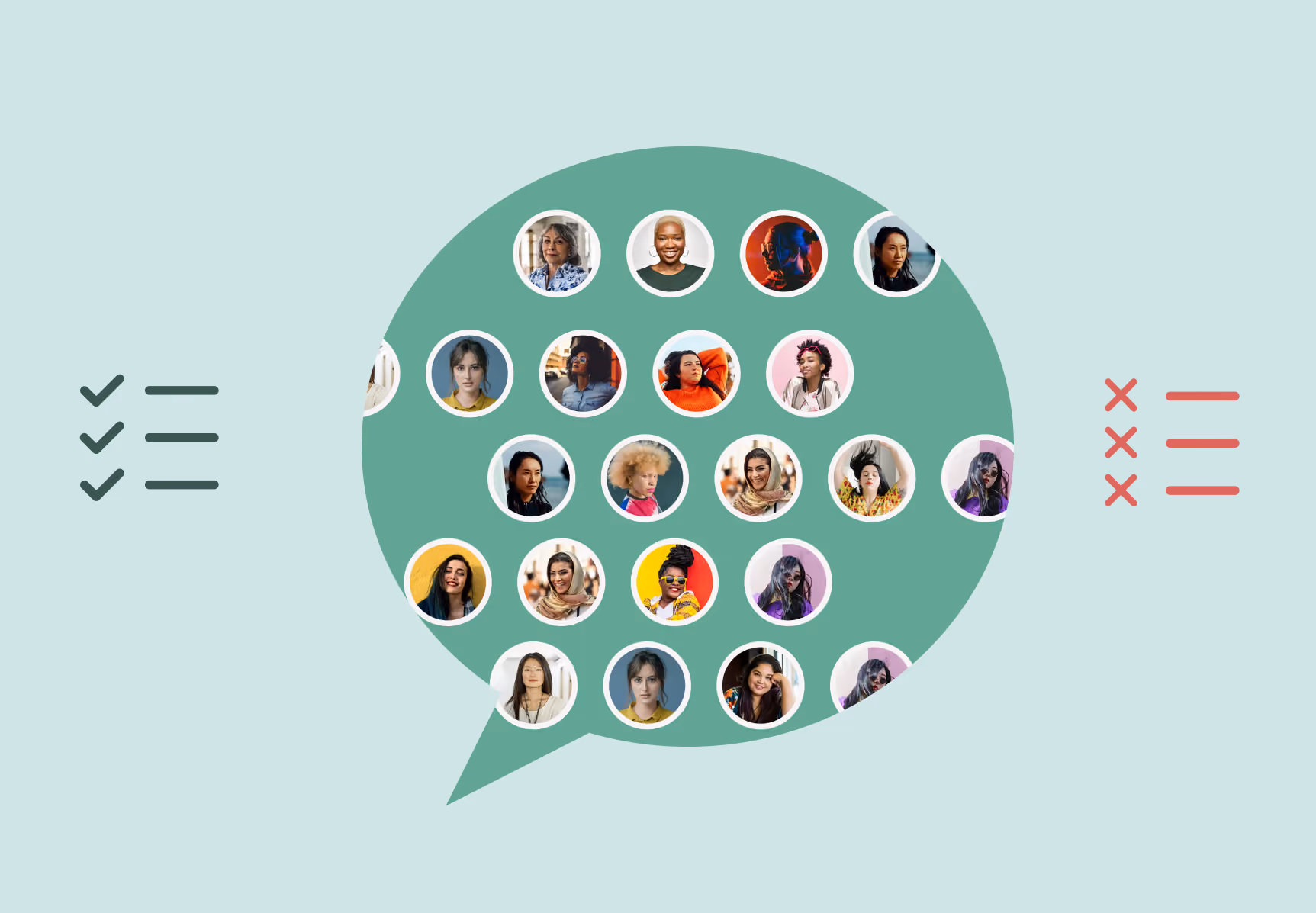
Social Proof
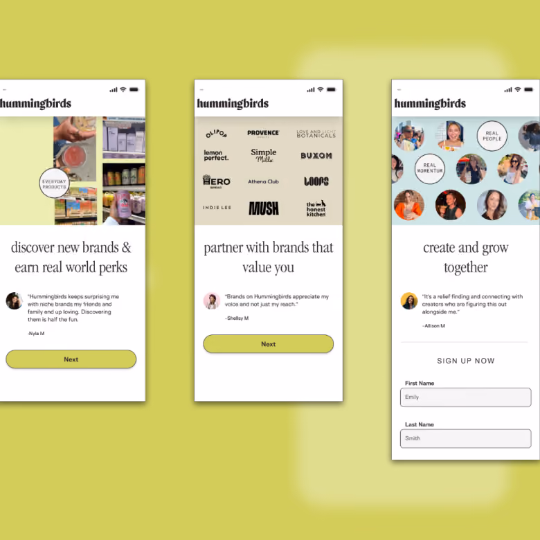
Before asking for any info, the flow made the case of why somebody should become a Hummingbird. Brand logos showed what to expect and a row of creator avatars made it feel like a real community they could join, not an untested product.
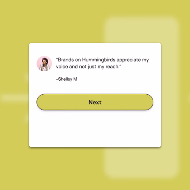
Straiht from the creators' mouths
Voice-Of-Customer
Using exact creators exact words to help bolster the value for potential creators.
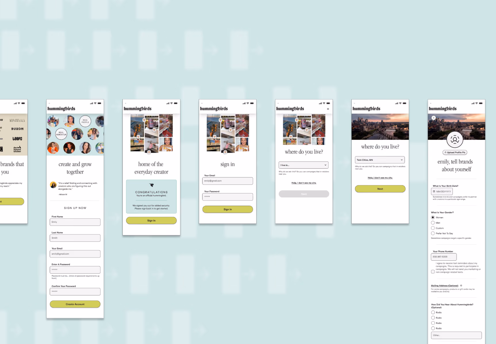
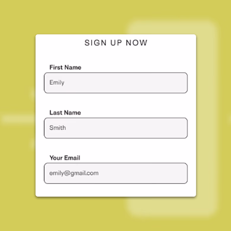
Easy asks first
Progressive Discolsure
Commitment Ramp
Name and email — low commitment, familiar, fast. Their city came next, because local matching is the whole product. Each small yes makes the next one easier to give.
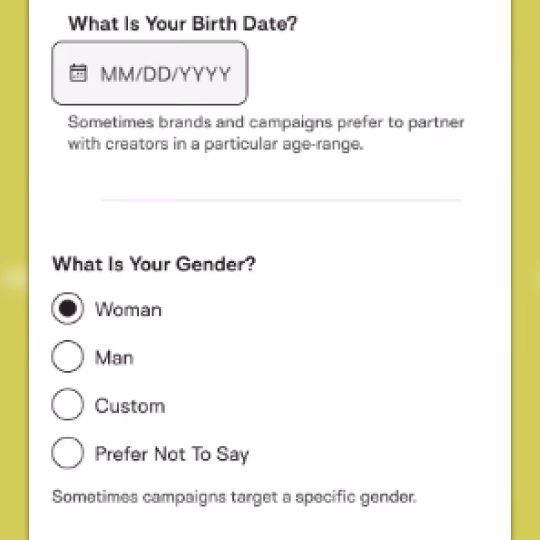
Harder asks, explained in the moment
Just-In-Time Context
Value-Exchange Transparency
Phone, gender, age each carried microcopy explaining why we wanted it and how brands used it — context delivered the instant it's needed, not buried in a policy nobody reads. Home address was optional, and we said so plainly, instead of hoping no one noticed.
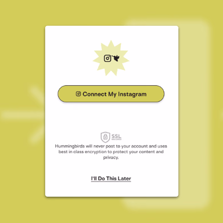
Security, right where the hesitation lived
Point-Of-Decision Reassurance
The Instagram connection was the biggest ask. So the security callout sat directly beside the connect button. Reassurance placed at the point of anxiety.

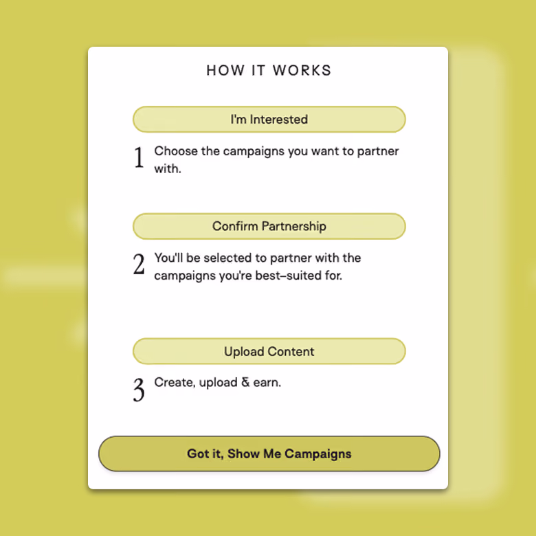
A real introduction, not a tooltip tour
First-Run Experience
Core-Loop Reveal
On completion, a quick 1 2 3 walk-through explained the actual loop — find a brand, create content, get paid. A quick, high-level mental model setting step.
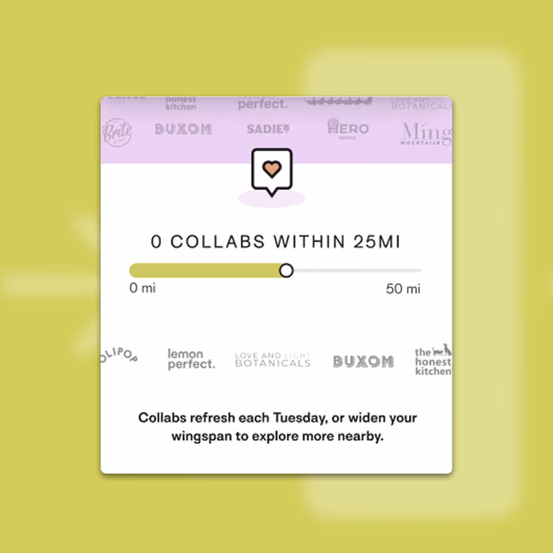
Empty states as a second onboarding layer
Empty-State As Scaffolding
Cntextual Onboarding
Underrated, and where the detail nerd in me got to play. Every empty state — no results, no active campaigns, no earnings yet, was treated as continued onboarding: here's what fills this when you're active, and here's your next move. The scaffolding stayed up until the product had something real to show.
How it held up
Three months from research to shipped flow. Twenty-five creators interviewed and surveyed. New sign-up completions rose 23% over the prior flow.

The skip logic, which created the most internal tension, was central to that number. The gate isn't at the door — it's one step past the moment curiosity turns into intent.

After launch, I continued using research to course-correct: small gaps in the flow, copy that wasn't landing, edge cases we hadn't anticipated. Onboarding isn't a one-time deliverable. It's a loop.
What I'd Do Differently
Pin down the technical constraints before designing, not during. A limitation in our HubSpot integration surfaced late and forced changes to a flow I'd already validated — fixable, but avoidable. Next time the integration requirements get mapped in the research phase, alongside the user needs, not after the UI's already taking shape.