Challenge Description
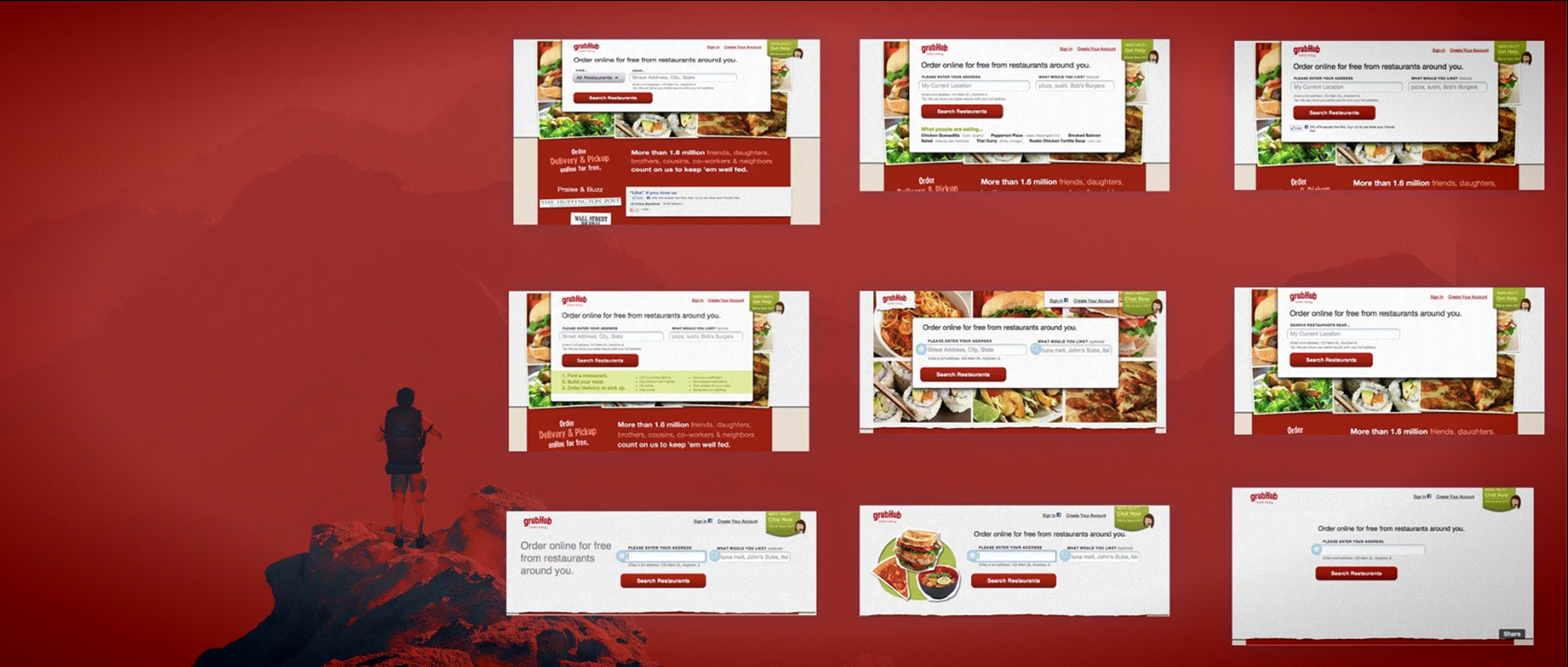
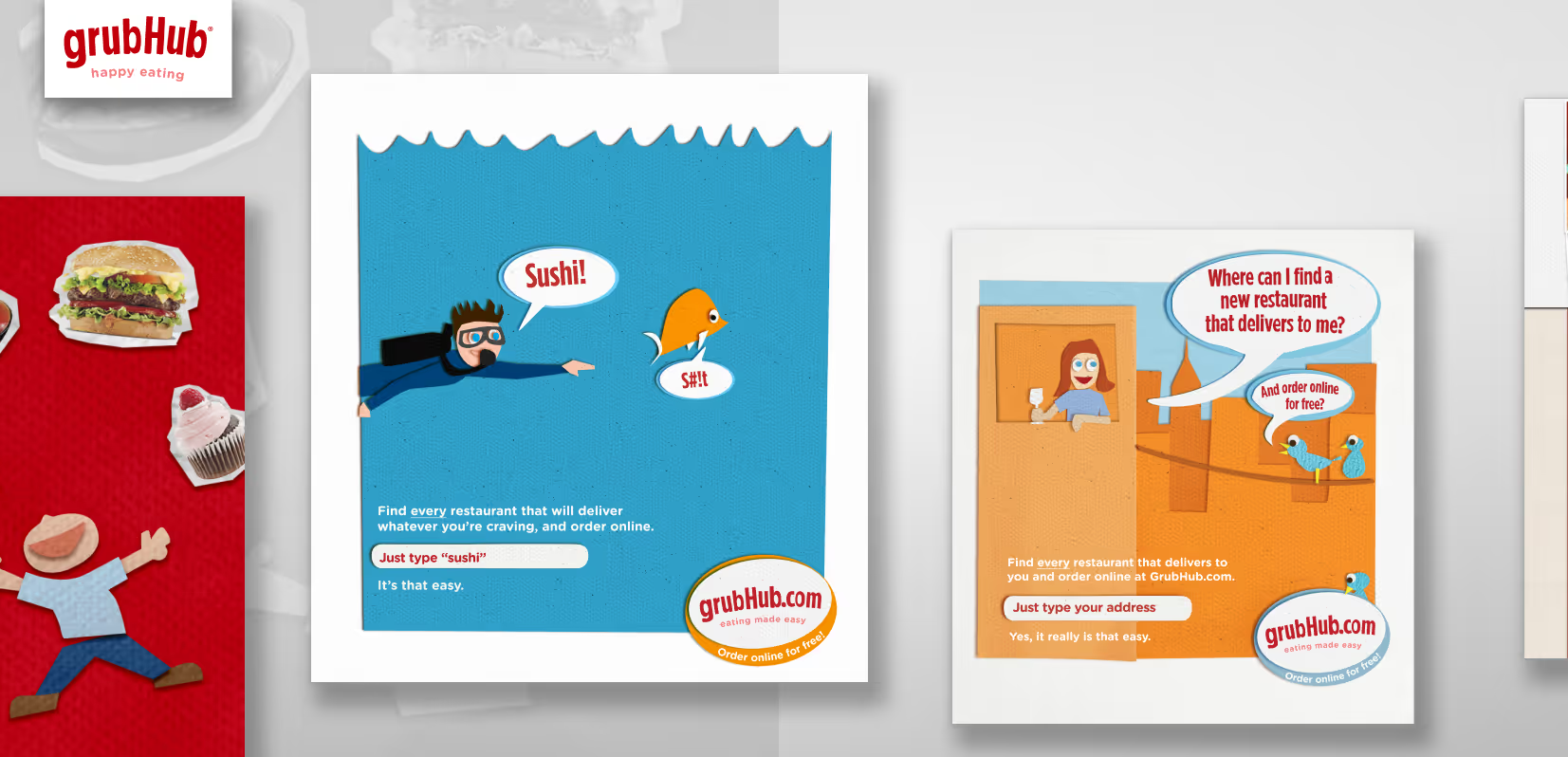
The problem. The homepage was busy. Restaurants, logos, promos, cuisine filters, a search field competing with all of it.
The call. We didn't pick a side. We wrote down both.
One hypothesis: stripping the page down creates a strong call to action and lowers abandonment. Headline, address field, nothing else. It looked like the kind of page you'd put in a portfolio.
The other: images of food, social data, and diner quotes build validity and trust for new diners, and that's what gets them to search.
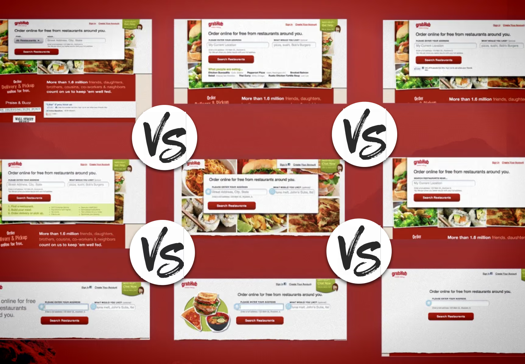
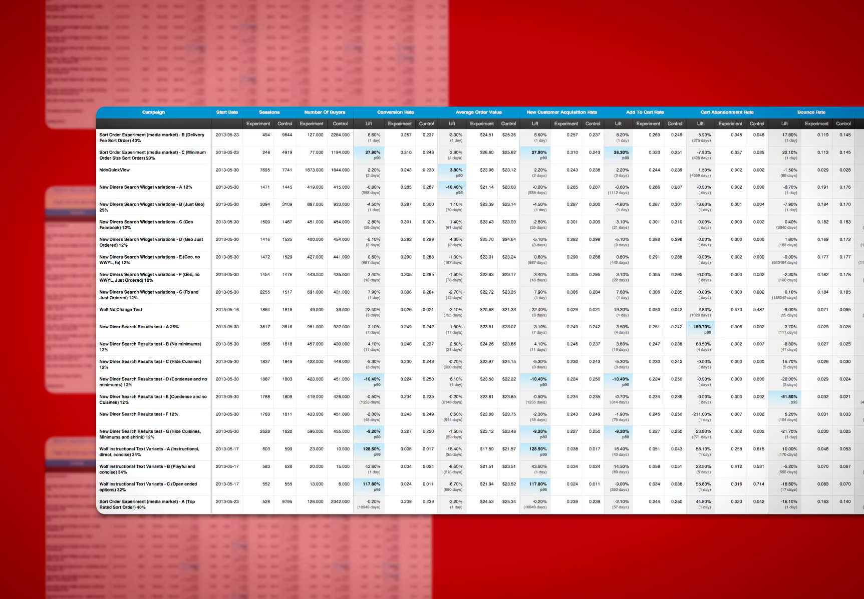
Those are opposite claims about the same page, and they went into the same deck in the same week. Nine variations, tested against each other.
Design note. Trust won. The clutter was the product — a restaurant grid isn't decoration on a food delivery site, it's the proof. Three hundred places near you deliver, and here are their names. The stripped page asked a first-time visitor to type their address on faith. The crowded one showed them why they should.
I was on the losing side of that. Every instinct from twenty years of graphic design said the quiet page would win — hierarchy, one idea per screen, negative space as a tool. Those principles are right about composition and wrong about a page whose only job is to establish that inventory exists.
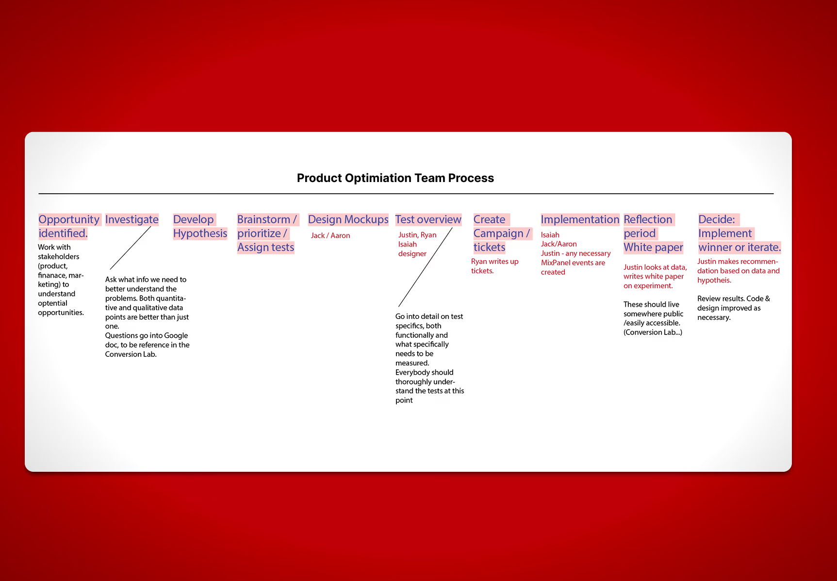
What I'd point to isn't that I was wrong, though. It's that being wrong cost the team nothing. Nobody had to lose an argument, and I didn't have to be talked out of my own taste by a colleague, which is a conversation that rarely ends with anyone changing their mind. The disagreement was a matter of record before either version was built, and the answer came back in two weeks.
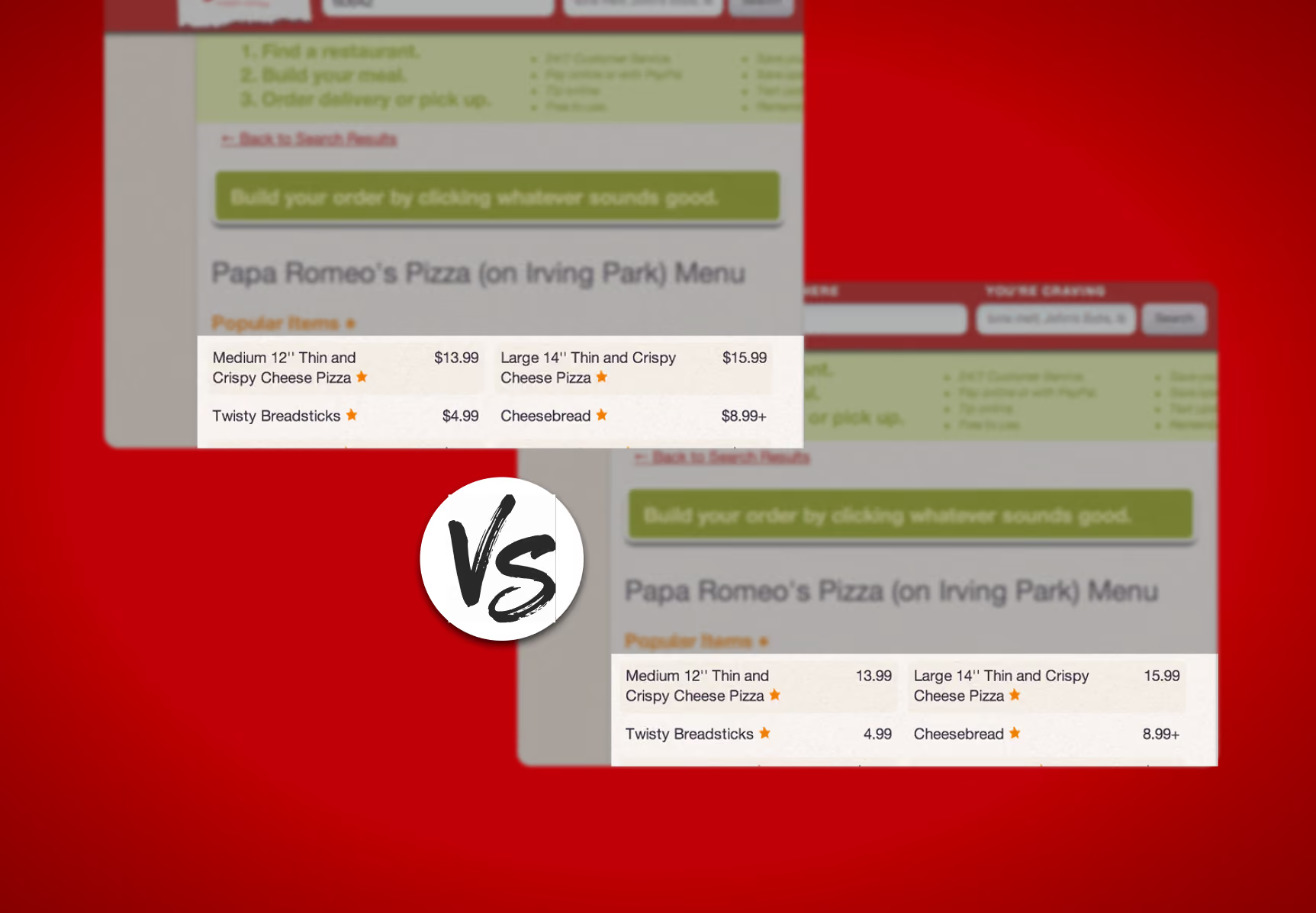
The nine variants moved the numbers less than removing one character from a menu did. That pattern held for three years: the size of the result tracks the size of the change to the user, not the size of the change to the design. Most of those homepages were a big change to the page and no change at all to the person looking at it — different layout, same job, type your address. That's restyling, and restyling moves nothing. The stripped one took away the proof, which is a real change, and it swung hard in the wrong direction. That's the other half of the rule: a real change gets you a real result, and a real result is just as likely to be bad.
So the useful question isn't "is this a big project." It's "does this change anything for the person on the other side." Those two come apart constantly, and a design team's default assumption is that they don't.